How We Rebranded Studio47 Pilates: Brand Strategy, Identity, and Website for a Rhode Island and Cape Cod Pilates Studio
The Short Version
Studio47 Pilates has been teaching Pilates in Rhode Island and Cape Cod since 2008. After 18 years in business, the studio’s owners, Elizabeth and Mora, were ready for a brand that matched the depth of what happens inside their studios. We partnered with them on a full Pilates studio rebrand: brand strategy, a new visual identity, photography direction, and a refresh of the website we designed for them a few years ago.
Below, we’re walking through how it came together, why we made the decisions we did, and what other boutique fitness studio owners can take from the process.
Project snapshot
- Client: Studio47 Pilates
- Locations: Warren, Rhode Island and Mashpee, Cape Cod
- Studio established: 2008
- Our services: Brand strategy, brand identity design, photography direction, website refresh (Showit), and a brand style guide
- Our history together: 4 years of working with Studio47
The Brief: A Brand That Matches 18 Years of Expertise
A rebrand for a studio with this much history is a different job than a rebrand for a brand-new studio. Nothing needed to be invented. Studio47 already had the credentials, the loyal clients, and the reputation. Our job was to find the words and visuals that express what was already true, and to do it in a way that sets the studio apart in a crowded Pilates market.
We got to do this with a team we already knew well. Eighteen years in business, four years of working together, and a lot of trust made this one of the more rewarding projects we’ve taken on. We love a long-term client relationship, and we love it even more when it leads to a new chapter like this one.

Brand Strategy: Starting With What Makes Studio47 Different
Before we designed anything, we built the strategy. This is the step that keeps a rebrand from being a cosmetic update, and it’s the part we’d encourage any studio owner not to skip.
Core Values
We identified four values that guide everything Studio47 does:
- Seasoned Expertise. Studio47 has been teaching Pilates for more than 20 years, since before it became a craze. Clients and trainees alike trust Studio47 because of the high-caliber instruction and deep expertise that can only be cultivated over decades.
- Balanced Body Education. Studio47 is one of the most sought-after Balanced Body training destinations in the Northeast, drawing students in from around the country. Students learn from a master educator with 20+ years of experience of hands-on training.
- Concierge Experience. Clients are known here: their injuries, their progress, and their goals. From being greeted by name to cuing that helps them truly improve their practice (not just be cheered on), Studio47 provides personal attention, prompt responses, and a level of professionalism that’s rare in group classes.
- True Pilates. Studio47 teaches Pilates as it’s been taught for more than a century, with careful cues to ensure every client masters the form that makes Pilates so effective. Unlike newer studios that chase trends, Studio47 is for those who value quality.
The Big Vision and Brand Personality
Every brand strategy we write includes a single guiding statement. For Studio47, it’s this:
Above everything else, you want to be known for 20+ years of expertise and personal attention that help people feel good in their bodies, consistent in their practice, and welcomed into a community.
We described the brand’s personality as wise, refined, warm, and straightforward, and never trendy, snobby, effusive, or arrogant. That last list became just as useful as the first, because it gave us a clear way to say no to creative choices that didn’t fit.
Who Studio47 Is Speaking To
Studio47’s ideal client is what we called the Professional Woman, age 30 to 65. She’s a mid-to-senior professional with disposable income, often in nursing, teaching, or another white-collar field, with a flexible schedule that lets her prioritize wellness. She’s dedicated to Pilates rather than chasing every new fitness trend.
When we looked at what she wants from a studio, four things stood out:
- She doesn’t want to feel anonymous.
- She wants Pilates rooted in tradition, without fads like heated classes.
- She wants to practice within a consistent community.
- She wants substance over aesthetics, with everyone in the room there for the right reasons.
We also looked at the neighbor brands she feels connected to: Vuori, Aesop, and West Elm. The takeaways were minimalist and refined logos with personality infused through subtle details, lowercase and title casing that feels approachable yet elevated, and warm, natural, rich colors in a gender-neutral palette.
Where Studio47 Fits in the Pilates Industry
We reviewed how other studios in the region present themselves, and they tended to fall into three groups:
- “Churn and burn” studios: refined, but watered down
- Trendy studios: aesthetic, but impersonal
- Traditional studios: classic, but dated
A few visual patterns showed up again and again. Many sites leaned on black backgrounds with colored club lighting, faded neutral imagery, or all-white layouts that felt cold. Many logos used delicate serifs that landed closer to a generic spa, circular badge marks, or literal fitness iconography.
That gave us a clear opening. We summed up how Studio47 breaks the mold in four lines:
- Established without feeling dated.
- Credentialed without feeling clinical.
- Friendly without feeling effusive.
- Elevated without feeling exclusive.
If you’re a studio owner wondering whether competitor research is worth it, this is the answer. It isn’t about copying anyone. It’s about seeing what’s overused so you can choose something different on purpose. (We did something similar in our Marisol rebrand for a Nantucket barre and Pilates studio, and it shaped that brand in a very different direction.)
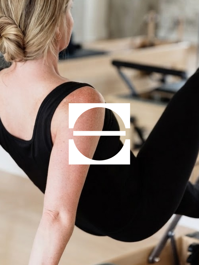
Brand Identity Design: Structure, Movement, and Quiet Confidence
With strategy locked in, we moved into the visual identity. We presented logo typography directions, a brand mark direction, and two color palette directions so Elizabeth and Mora could react to real options.
The Wordmark
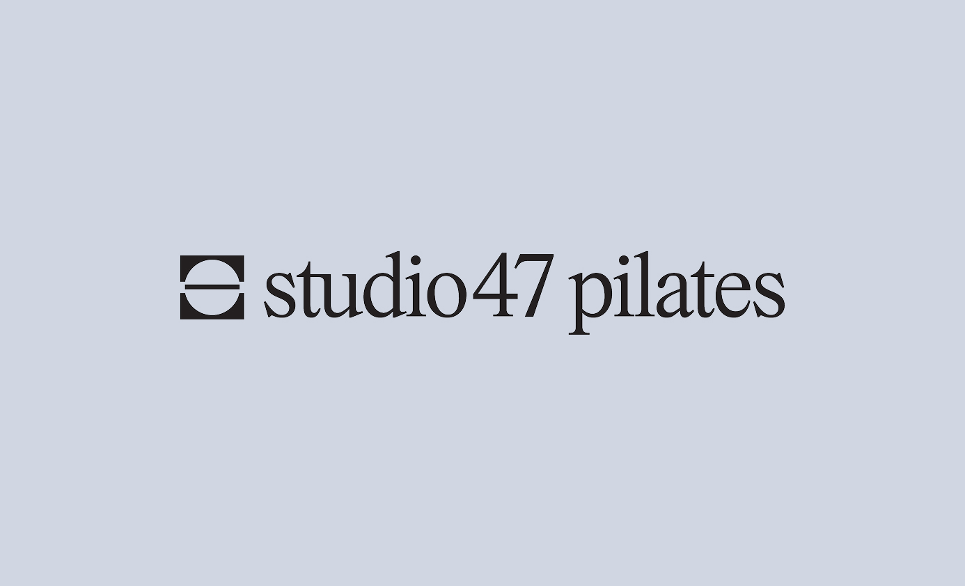
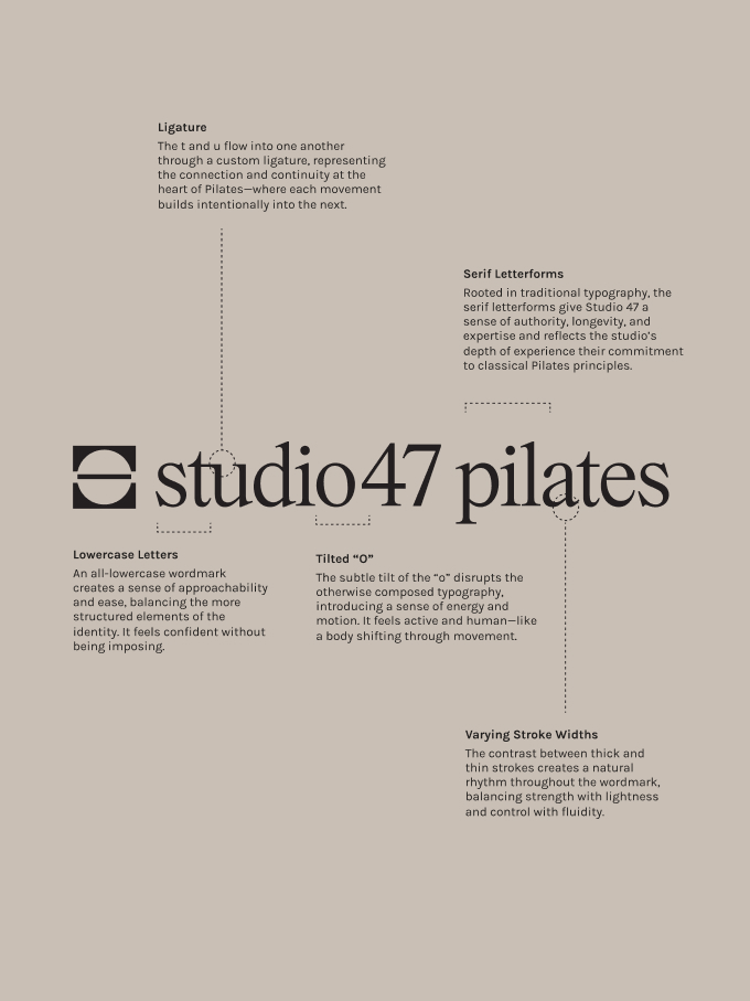
The studio47 pilates wordmark is set in all lowercase serif letterforms, which gives it authority and longevity while keeping it approachable. A few details we’re especially proud of:
- A custom ligature where the t and u flow into one another, representing connection and continuity, with each movement building intentionally into the next.
- Sculpted wedge serifs that add strength, precision, and subtle movement.
- A subtly tilted “o” that interrupts the otherwise composed typography with a little energy, like a body shifting through movement.
- Varying stroke widths that balance strength with lightness and control with fluidity.
The Brand Mark
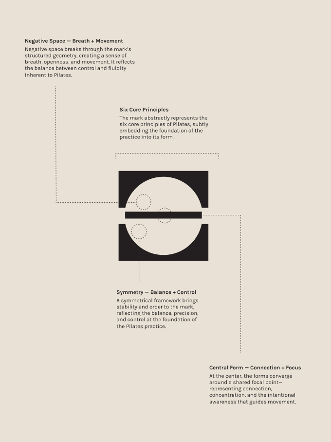
The brand mark uses geometric forms and negative space to abstractly represent the six core principles of Pilates. A symmetrical framework brings balance and control. Negative space breaks through the structure to suggest breath and movement. At the center, the forms converge around a shared focal point that stands for connection, concentration, and intentional awareness.
We built a flexible logo system around it: a primary horizontal logo, left-aligned and centered secondary logos, an alternate stacked logo, and primary and secondary brand marks (including horizontal and vertical versions with the word PILATES). Each one has guidance for where it works best, from website headers to merch and studio graphics.
The Color Palette
The final palette is inspired by natural materials and soft atmospheric light. Warm neutrals create a grounded foundation, and a pale blue adds freshness and a little energy.
It’s a restrained palette that feels timeless rather than trend-driven, which is exactly the point for a studio that has been doing true Pilates since 2008.
Typography
We paired the wordmark with Neue Swiss across the system. It’s clean, modern, and highly legible, so Studio47’s expertise can take center stage. We defined each level of the hierarchy (eyebrow labels, headlines, subheadlines, body copy, and buttons) so the team can apply it consistently on their own.
Photography Direction: Warm, Natural, and Movement-Led
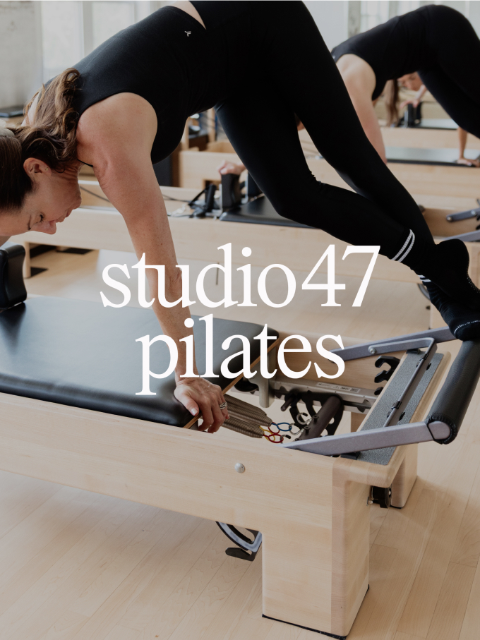
For a fitness studio, photography is part of the brand, not a finishing touch. We created photography direction so Studio47’s future imagery would feel refined but never overly polished, capturing the strength, fluidity, and human quality of Pilates. The direction centered on five ideas:
- Warm + muted (not desaturated): soft natural light and warm color that preserves natural skin tones
- Movement + perspective: candid, effortless movement, mixing wider compositions with intimate details and unexpected crops
- Minimal + tonal: restrained environments and styling, with attire in creams, browns, and warm neutrals, and black used selectively
- Soft contrast: shadows and highlights that keep their softness and dimension
- Black and white, used sparingly: a point of contrast within the larger image library, with softer tonal treatments over stark, graphic ones
If you’re planning a brand shoot, we have a free photoshoot prep guide and a curated photographer directory that can help.

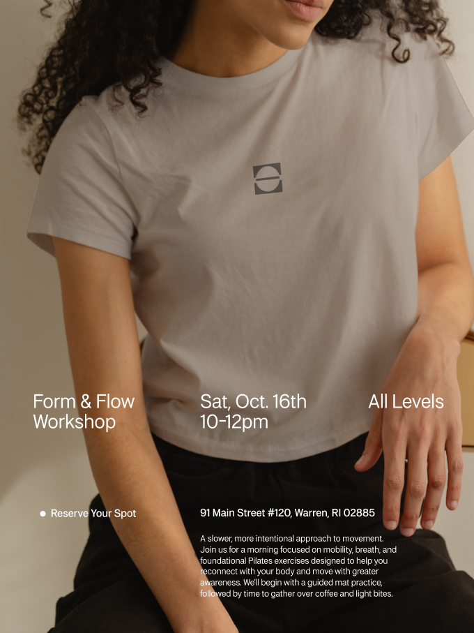
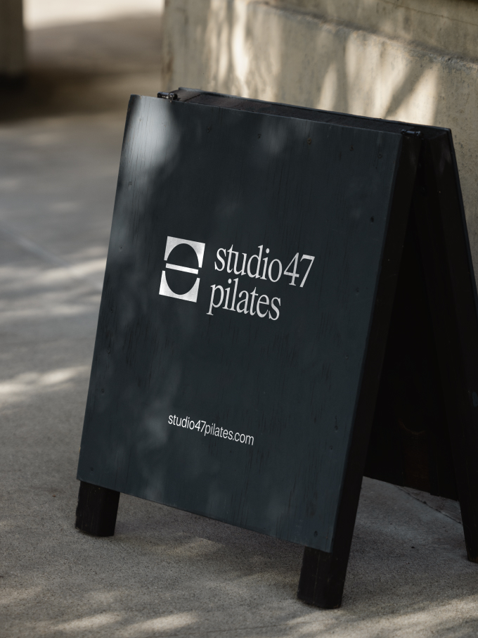

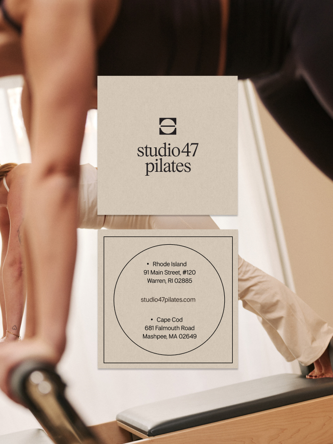
The Website Refresh and Brand Applications
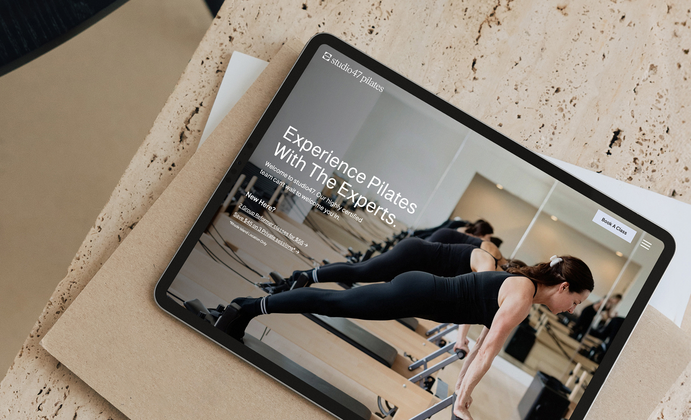
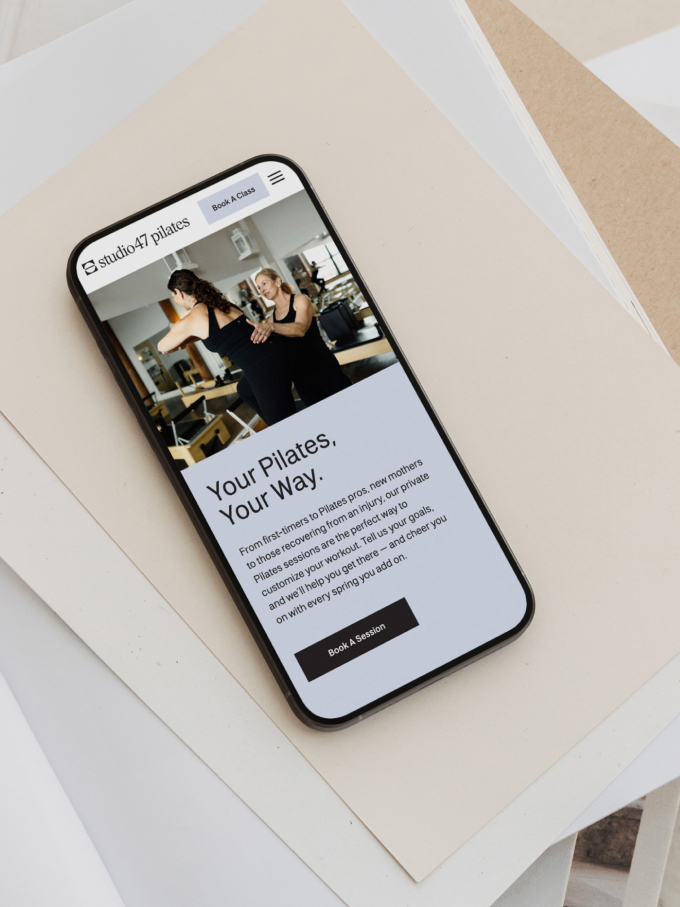
We designed the Studio47 website on Showit a few years ago, so this refresh was a chance to bring the new identity into a site we already knew well. The goal was a site that reflects the refined, welcoming feel of the new brand while making it easy for clients to explore classes and book.
Beyond the website, we mocked up and presented examples of how the identity could be applied across Instagram posts and profile, studio signage, a sidewalk sign, business cards, a tote bag, apparel, a cap, a workshop poster, and even a Pilates ball. We also delivered a comprehensive brand style guide and organized brand files for web, print, and fonts, so Elizabeth and Mora can make confident design decisions on their own as the studio grows.

What Elizabeth and Mora Said
After the launch, the Studio47 team sent us a note that we’re still smiling about. We’re grateful to share a few pieces of it here.
“From start to finish, you were an absolute dream to work with. Your creativity, professionalism, responsiveness, and attention to detail exceeded our expectations. You took our vision and elevated it into something we are genuinely so proud of.”
They also shared this about a part of the project that added an extra design challenge:
“We are especially grateful for the way you navigated the unexpected legal challenges with such grace, flexibility, and creativity. What could have been an incredibly stressful process felt seamless because of your expertise and dedication.”
And on the final result:
“We are beyond thrilled with the final result and so grateful for the talent, thoughtfulness, and heart you poured into this project. We absolutely loved working with you and cannot recommend your team highly enough!”
That’s what we aim for on every project: a team that listens, a strategy that holds up, and a client who feels proud of what they put out into the world.
What This Pilates Studio Rebrand Taught Us
1. A long history is an asset, so build the brand around it. Eighteen years of expertise gave Studio47 something many newer studios can’t claim. The rebrand put that front and center.
2. Strategy keeps the design honest. The brand personality list (including what the brand is never) made it easier to evaluate every logo, color, and layout decision.
3. Know what’s overused in your market. Studying the competitive landscape showed us what to avoid, and gave Studio47 a clear way to stand out.
4. Your brand mark and wordmark should do different jobs. The mark is geometric and controlled. The wordmark brings rhythm and humanity. Together they balance structure and movement, which is the heart of Pilates.
5. Photography direction protects your brand over time. Clear guidance helps every future photo shoot and social post feel like it belongs to the same studio.
Frequently Asked Questions About Rebranding a Pilates Studio
What is included in a Pilates studio rebrand?
It depends on the studio’s needs. For Studio47, we provided brand strategy, brand identity design (logo suite, color palette, and typography), photography direction, a website refresh on Showit, and a brand style guide with organized logo and font files.
Why start a rebrand with brand strategy?
Strategy defines your values, your ideal client, and where you fit in your market before any design begins. That makes every later decision easier, from a logo detail to a photo choice, because you can ask whether it supports the strategy.
Can a long-established studio rebrand without losing what makes it special?
Yes, and the best rebrands build on what already makes the studio special. For Studio47, the work was about expressing 18 years of expertise and personal attention more clearly, not replacing it.
How do you choose a color palette for a Pilates studio?
We start with the audience and the feeling the studio wants to create, then look at what competitors overuse. For Studio47, that led to warm neutrals and a soft sky blue that feel calm, grounded, and timeless.
Do you design websites for Pilates studios?
Yes. We work exclusively with boutique fitness studios and wellness professionals, and we build custom websites on Showit. You can see more on our 1:1 Brand & Web Design page.
Thinking About a Rebrand for Your Studio?
If you own a Pilates, barre, yoga, or boutique fitness studio and you’re ready for a brand that reflects who you are and who you serve, we’d love to talk. We combine brand strategy, identity design, photography direction, and web design for fitness businesses, and we’re a team that understands this industry from the inside. See our 1:1 Brand & Web Design services or let’s talk about what’s next for your studio.
In the meantime, take a look at the new Studio47 Pilates website, and follow @studio47pilates on Instagram to see the brand in action. We’re so excited for Elizabeth and Mora, and for everything this next chapter holds.
You can also read more of our work in The Rep Club brand launch case study and the Marisol rebrand case study.


FILED IN:
Clients, Design
SHARE ON: