
Is there anything dreamier than a barre and Pilates studio on Nantucket? We didn’t think so either, which is exactly why we were thrilled when Kristen Giddings asked us to help rebrand her fitness studio, Marisol.
What started as a vision for a refined, modern wellness brand became a comprehensive brand transformation that touched every aspect of her business, from strategy and visual identity to website design and photography direction. Here’s how we approached this boutique fitness studio rebrand and what we learned along the way.
The Brief: Creating a Coastal, Intelligent Fitness Brand
When Kristen came to us, she had a clear vision: she wanted Marisol to be known as a barre and Pilates studio built on contagious energy, deep expertise, and intelligent workouts that challenge clients. But translating that vision into a cohesive brand identity required digging deeper.
We started with strategy, the foundation that everything else would build upon.
Understanding the Brand Through Strategy
Before we designed a single logo or chose a color, we needed to understand what made Marisol different in a crowded boutique fitness market. Through an in-depth discovery process, we identified Marisol’s core values:
Approachable Biomechanics. Our instructors lead with deep anatomy knowledge, movement mechanics, and thoughtful programming, but expressed in accessible, practical language. This allows us to push clients for optimal results without risking injury.
Upbeat Motivation. Marisol instructors don’t just “teach a class;” they connect deeply with clients, cheer them on, and keep the vibe high-energy. Classes are fun and motivating, and instructors feel like friends.
Competence Over Aesthetics. Clients always leave feeling better than when they came in, and this compounds over time as clients build capability and confidence in their bodies. Looking as good as you feel is a bonus!
Welcoming Community. Marisol classes, especially during the summer, are packed with happy clients, fostering a warm, “we’re here to make friends” experience. People show up authentically, rather than performatively.
This strategy became the north star for every design decision that followed.
Defining the Target Audience
Understanding who Marisol serves was equally important. Through audience research, we identified three primary personas:
- The Power Woman (35-65): Former high-powered professionals now enjoying flexible work and summer life on Nantucket. She wants excellence in instruction, a fun atmosphere, and tasteful luxury.
- The Affluent SAHM (35-65): A stay-at-home mom seeking community, that Nantucket beach feeling, and confidence in her body. She values the social aspect as much as the workout.
- The Nantucket Local (emerging focus): Year-round island residents and service industry workers seeking convenient, effective classes.
Each persona shaped our design decisions and content strategy. The brand needed to feel upscale without being pretentious, sophisticated without being cold, and welcoming without being bubbly.


The Design Direction: Coastal, Airy, Elevated
With strategy locked in, we moved into visual identity (where the magic really happens).
The Wordmark: Refined Yet Human
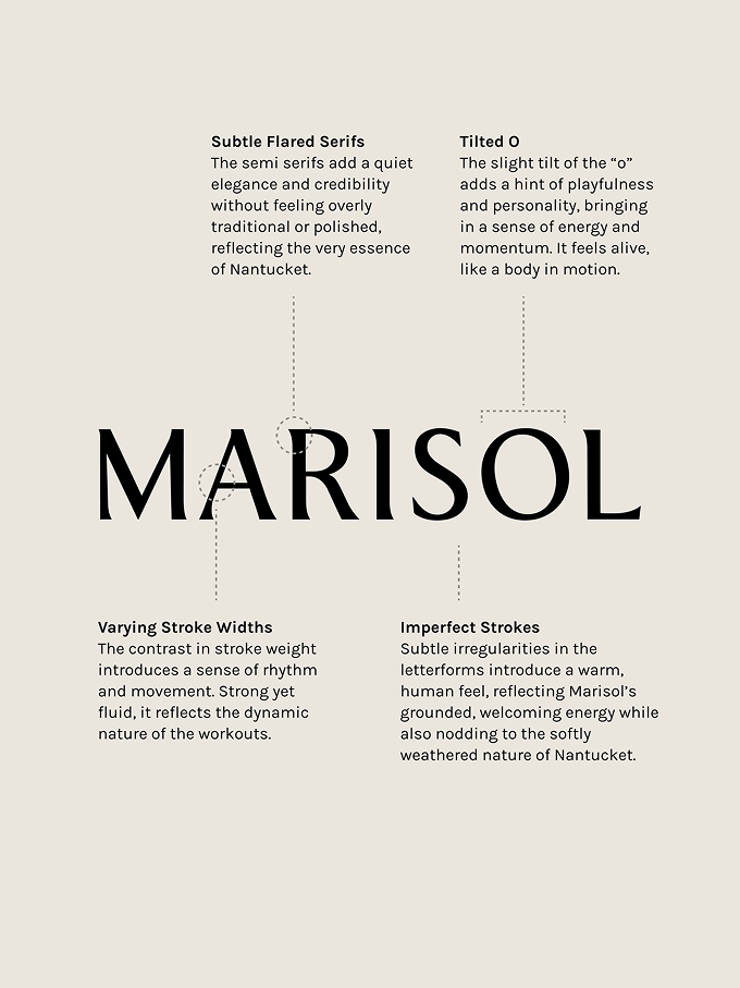
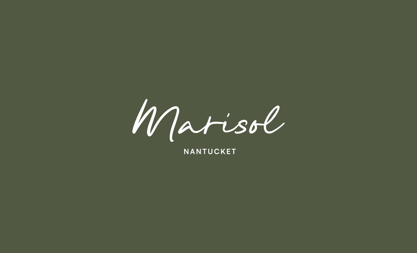
The Marisol wordmark is a semi-serif font with intentional details. The subtle flared serifs add quiet elegance and credibility without feeling overly traditional, perfect for reflecting Nantucket’s essence. Meanwhile, the slightly tilted “O” brings playfulness and a sense of energy, like a body in motion. Even the imperfect strokes introduce warmth and humanity to the letterforms.
It’s polished enough for luxury, but human enough to feel grounded and welcoming.
The Color Palette: Inspired by Nantucket’s Natural Textures
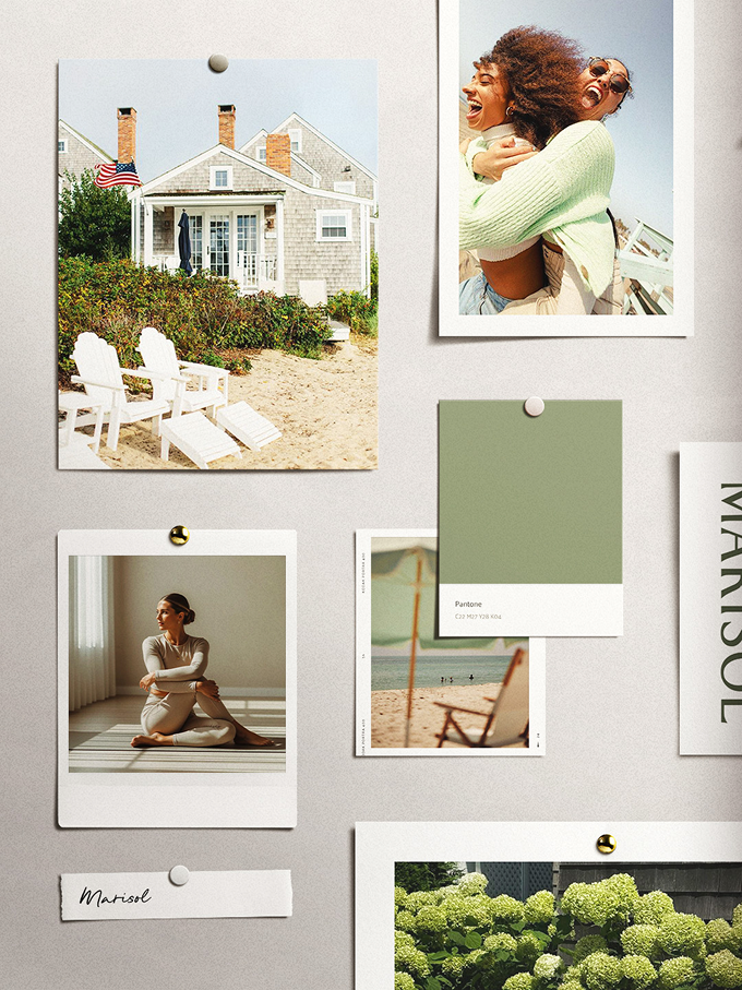
Instead of leaning into expected Nantucket clichés, we created a coastal, airy palette inspired by hydrangea gardens, beach grasses, and weathered seaside cottages:
- Olive and Sage greens introduce vitality and renewal, qualities that align perfectly with a movement practice focused on strength and transformation.
- Soft sand and cream neutrals reference natural beaches and weathered architecture, keeping the palette light and approachable.
- Creamy lime accent brings warmth and freshness, used sparingly for interactive elements.
The palette feels natural, relaxed, and quietly elevated—reflecting a studio rooted in thoughtful instruction and genuine wellbeing while capturing Nantucket’s spirit in a subtle, understated way.
Photography Direction: Capturing Authentic Community
One of the most important aspects of a fitness studio brand is photography. It should inspire people to show up and feel the energy of the space.
We provided detailed photography direction across five categories:
- Group Classes: Wide-angle shots showing full classes, trainers cueing clients, and backlit sunlight creating soft, welcoming energy.
- Genuine Community: Candid moments of clients connecting—laughing, chatting before class, hugging after workouts. The focus is fun and authenticity, never performative.
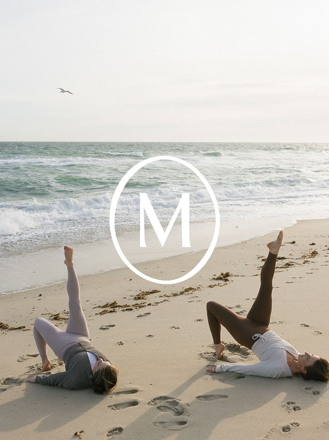
- Beach Classes: Similar direction to group classes but with that Nantucket setting, capturing the unique offering and embracing the island location.
- Instructor Headshots: Portraits in multiple settings (outside with blue sky, in-studio with natural light) that convey the same airy, vibrant aesthetic.
- Private/Duet Sessions: Limited but important imagery showing 1:1 instruction and the calm, private space that differentiates premium offerings.
The photography needed to feel consistent across platforms while bringing the brand personality to life: upbeat, intelligent, grounded, and elevated.



From Vision to Implementation: The Website & Beyond
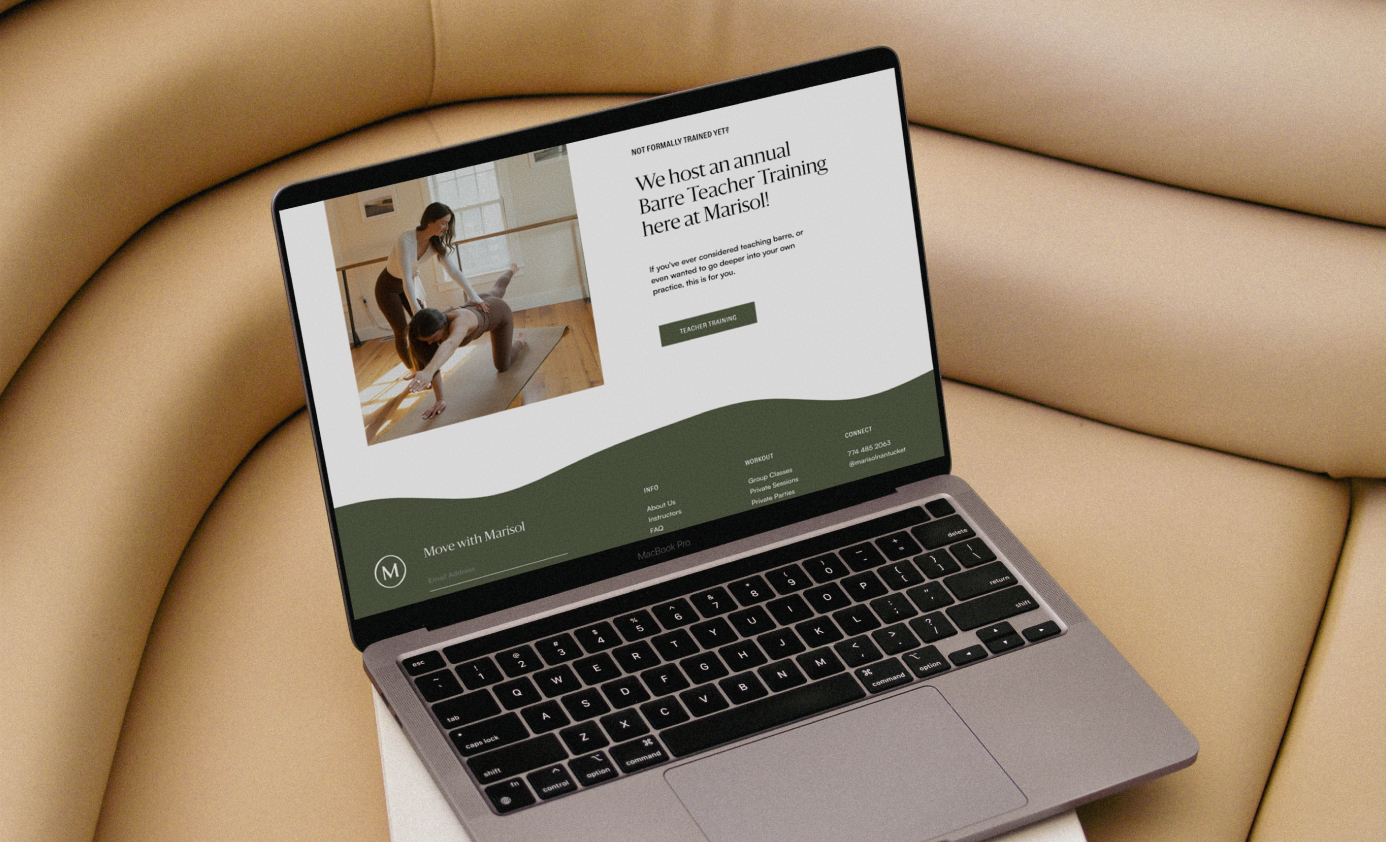
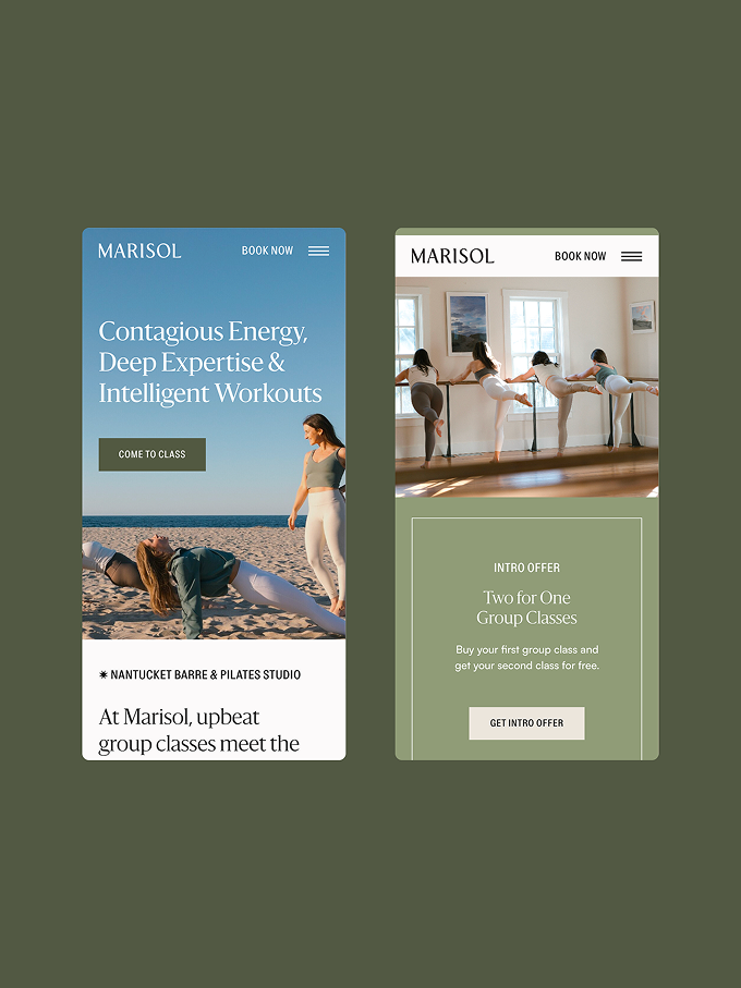
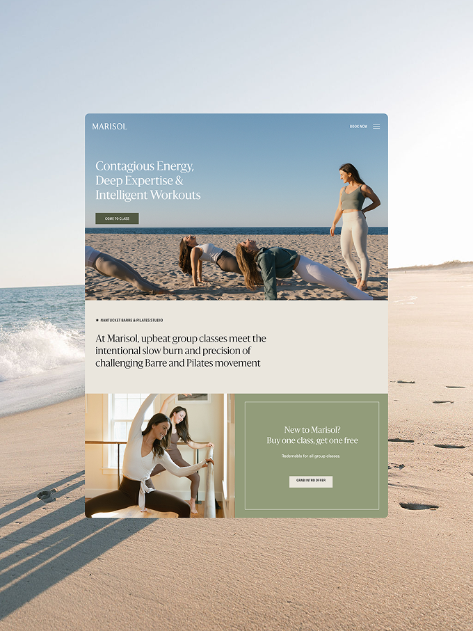
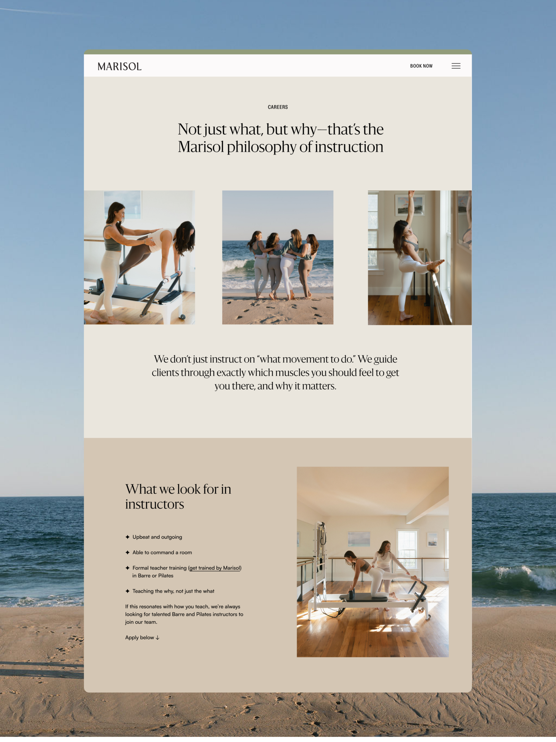
With brand strategy and visual identity in place, we moved into web design and development on Showit. Our team designed the site to showcase Marisol’s beautiful photography and refined aesthetic, while also crafting the website copy and optimizing for search (SEO) to ensure potential clients could find her online.
The website needed to do several things:
- Communicate Marisol’s positioning as a premium, thoughtful fitness experience
- Showcase the studio’s light-filled space and community
- Make it easy to explore class offerings (group, beach, private)
- Convert visitors into members
But beyond the website, we mocked up and presented examples of how the visual identity could be applied across:
- Social media graphics and templates for consistent, branded content
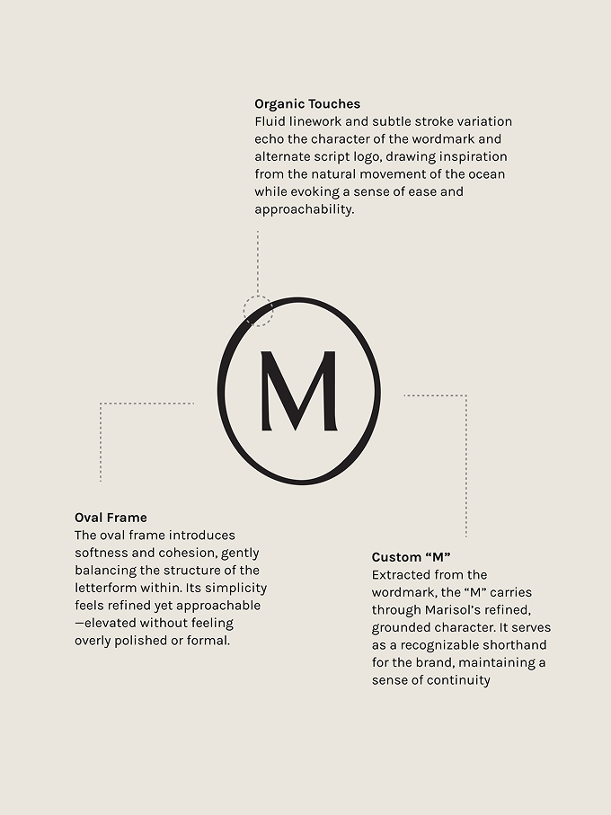
- Apparel designs featuring the brand mark and alternate script logo
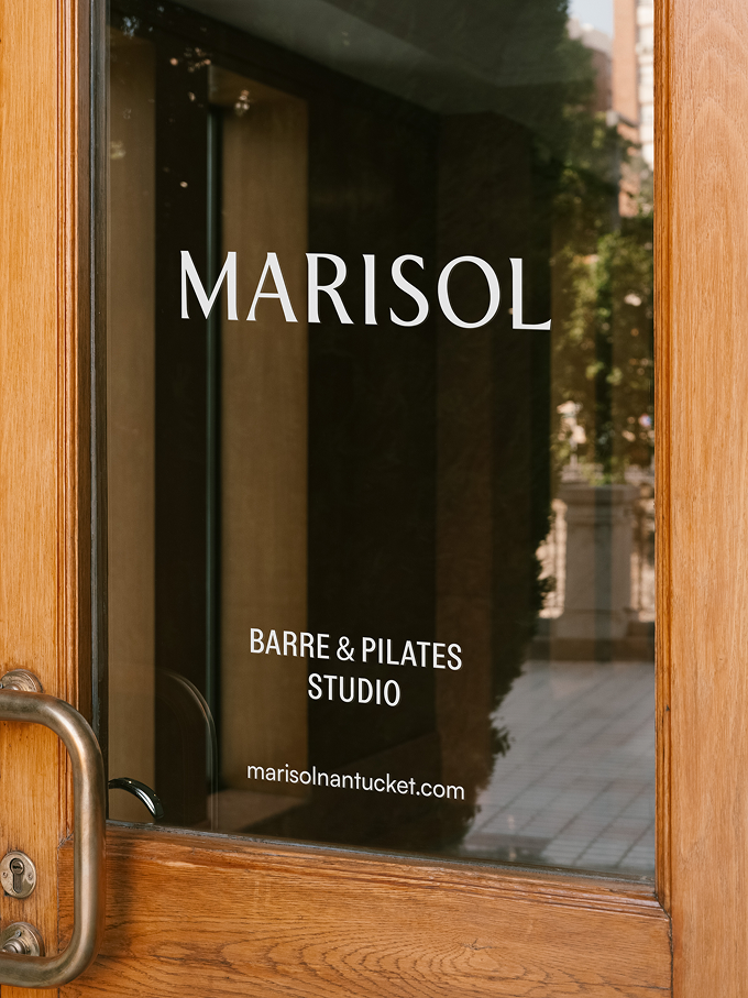
- Studio signage and door graphics
- Business cards and collateral with embossed details and sophisticated finishes
- A comprehensive brand style guide giving Kristen confidence to make design decisions independently as her business grows
The Client Experience: What Kristen Had to Say
When a rebrand is successful, the client sees it immediately. Here’s what Kristen shared about working with us:
“The detail!” she told us. “I loved everything from the in-depth questionnaire and kickoff call, to each one of the presentations. It was so clear the amount of time and effort that was going into creating a thoughtful, unique all-encompassing rebrand.”
But beyond the process, she was blown away by the creative direction:
“You took my inspiration and created something 10x better. I was majorly impressed by the way you listened to how I described the studio and everything I wanted the brand to become, used your very clear expertise in the industry, and pitched me back a rebrand that was entirely different—and better—than my original vision.”
And when reflecting on the iterative process:
“Everything you could hope for when rebranding your business! The iterations evolved through each draft and revision. I would take your first draft and share my thoughts/concerns/edits/etc, and the second draft would be absolutely perfect and spot on. You truly listened and understood my goals and then executed on them perfectly.”
These testimonials perfectly captured what we aim for with every project: deep listening, strategic expertise, beautiful execution, and a client who feels genuinely understood.
What This Rebrand Taught Us
The Marisol project reinforced several truths about rebranding boutique fitness studios:
1. Strategy Before Design
It’s tempting to jump straight to logos and colors, but the most successful brands start with strategy. Understanding core values, target audiences, and positioning makes every design decision easier and more intentional.
2. Authenticity Over Trends
Marisol’s brand doesn’t follow fitness industry clichés. It’s not overly trendy or Instagrammy. Instead, it feels rooted in genuine values and community—which is far more compelling long-term.
3. Photography Is Part of Your Brand
For a fitness studio, photography isn’t an afterthought. It’s core to how people experience and connect with your brand. Providing clear direction ensures consistency and quality across all marketing channels.
4. A Good Rebrand Requires Trust
Kristen trusted us to challenge her initial vision and pitch back something better. That level of collaboration—and the confidence to step back and let creative experts do their work—is essential to breakthrough branding.
5. Implementation Matters
The best strategy in the world means nothing if it’s not executed across all touchpoints. From website to social to apparel to studio signage, consistency builds recognition and trust.
Is Your Fitness Studio Ready to Rebrand?
If you’re a boutique fitness studio owner considering a rebrand, ask yourself these questions:
- Does your current brand clearly communicate your unique positioning?
- Do your visual identity and messaging resonate with your target audience?
- Is your brand consistent across all touchpoints (website, social, studio, collateral)?
- Do you have the in-house expertise to execute a comprehensive rebrand?
- Are you ready to invest in strategy before jumping to design?
A rebrand isn’t just about looking better (though that’s certainly part of it). It’s about clarifying who you are, who you serve, and why you do what you do—then expressing that through every interaction a client has with your brand.
For Marisol, the rebrand has become a competitive advantage. Kristen now has a brand that attracts the right clients, positions her as a premium offering, and gives her complete confidence in how she presents herself to the world.
Ready to Transform Your Fitness Studio Brand?
We specialize in working with boutique fitness studios, wellness professionals, and fitness entrepreneurs who are ready to rebrand strategically. If you’re ready to move beyond basic aesthetics into a brand that truly reflects your values and attracts your ideal clients, let’s talk.
In the meantime, check out Marisol’s website to see this rebrand in action, and head to @marisolnantucket on Instagram to see how the brand comes to life on social media.
Because is there really anything dreamier than a barre and Pilates studio built on contagious energy, deep expertise, and intelligent workouts that challenge you? We didn’t think so either.


FILED IN:
Clients, Design
SHARE ON: