Løuco
January 28, 2022
NEW branding for wellness brand, Løuco, a safe, ethically-made, supplemental nutrition for women coming out in 2022.
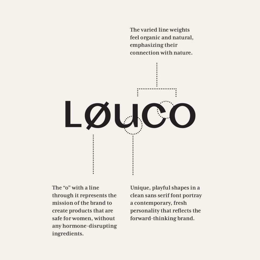
The name Løuco represents the collaboration of two women and mothers, their personal and professional experiences a catalyst for the brand. The “o” with a line through it represents the mission of the brand to create products that are safe for women, without any hormone-disrupting ingredients.
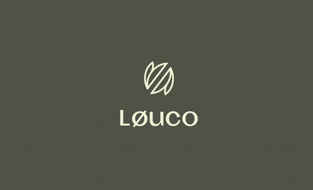
The typographic logo utilizes unique, playful shapes in a custom sans serif font to portray a contemporary, fresh personality that reflects the forward-thinking brand. The varied line weights of this custom typography feel organic and natural, emphasizing the brand’s connection with nature.
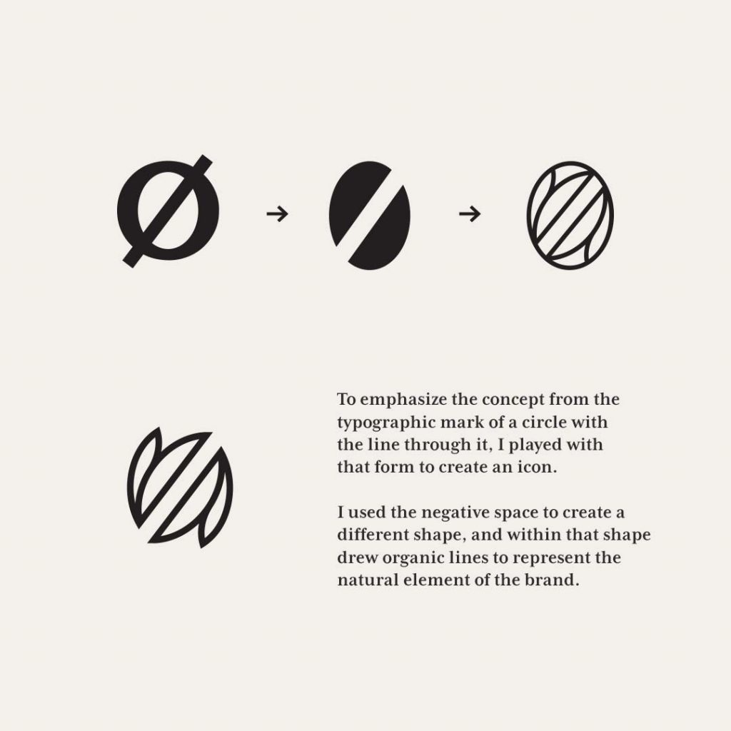
For the brand’s icon I wanted to emphasize the concept of the ø from the typographic mark. I used the negative space of that form to create a different shape, drawing organic lines within it to represent the natural element of the brand.
Follow along with Løuco for their launch this year!

FILED IN:
Clients, Design, Portfolio
SHARE ON: