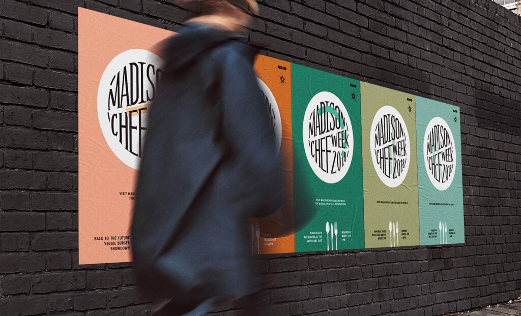
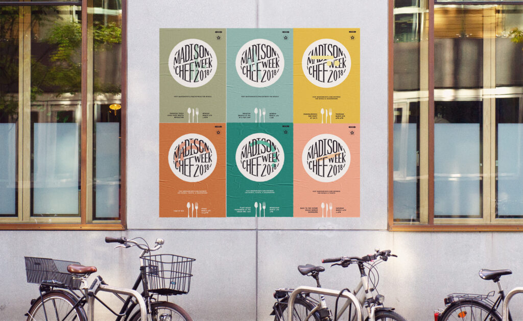
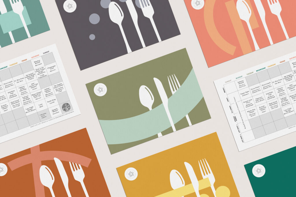
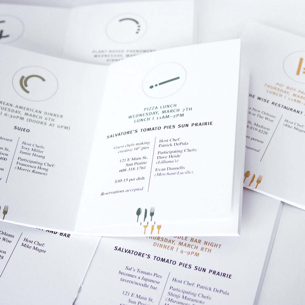
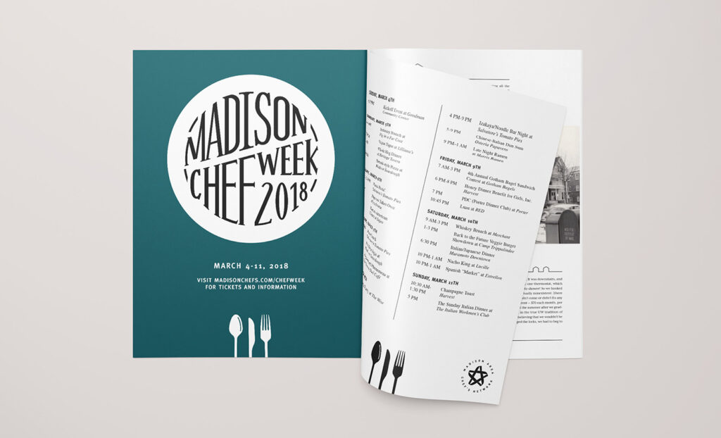
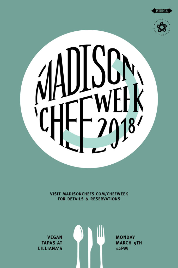
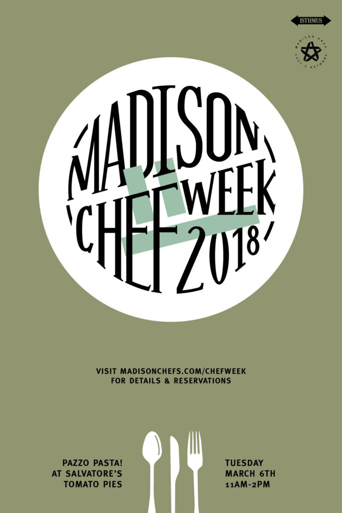
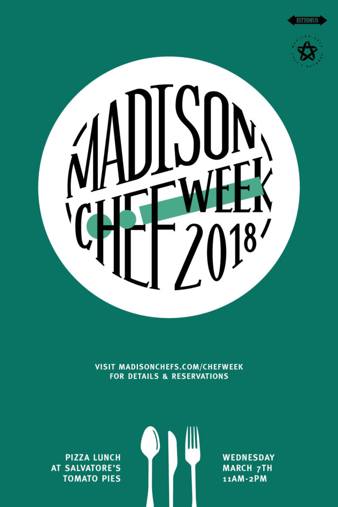
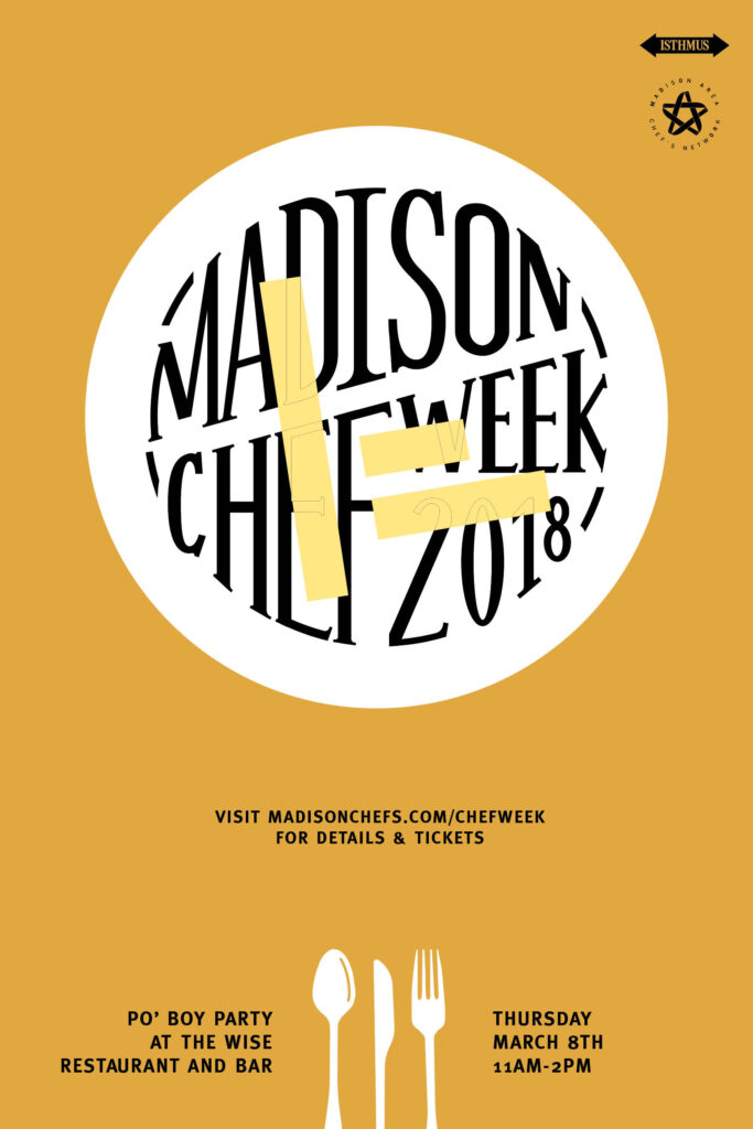
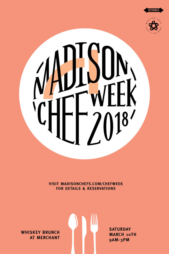
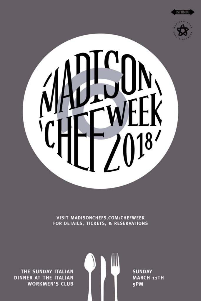
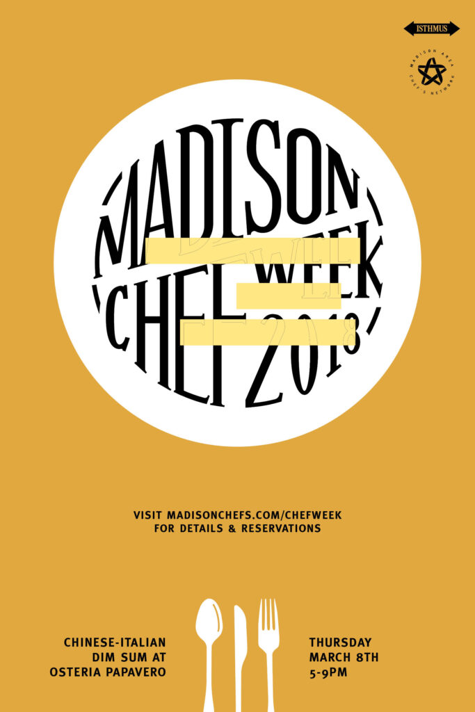
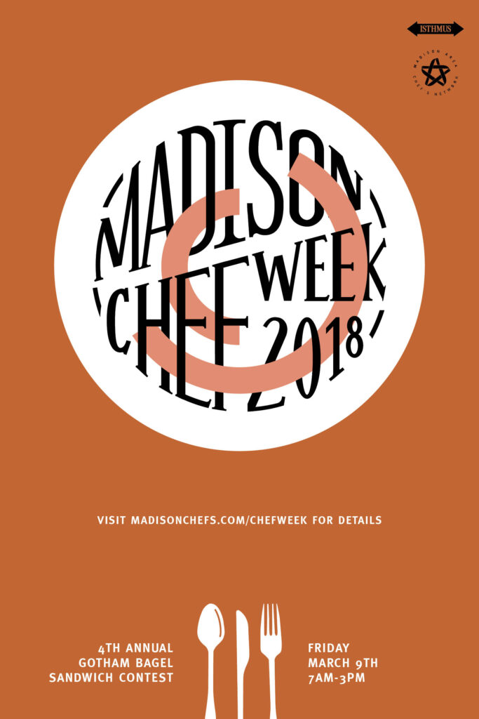
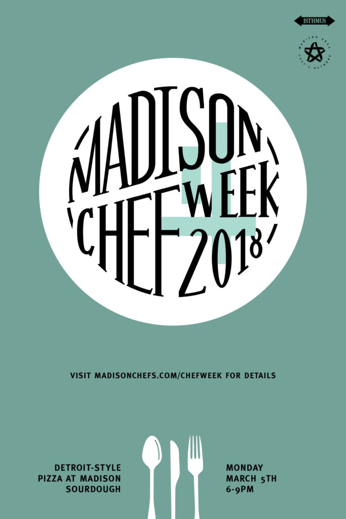
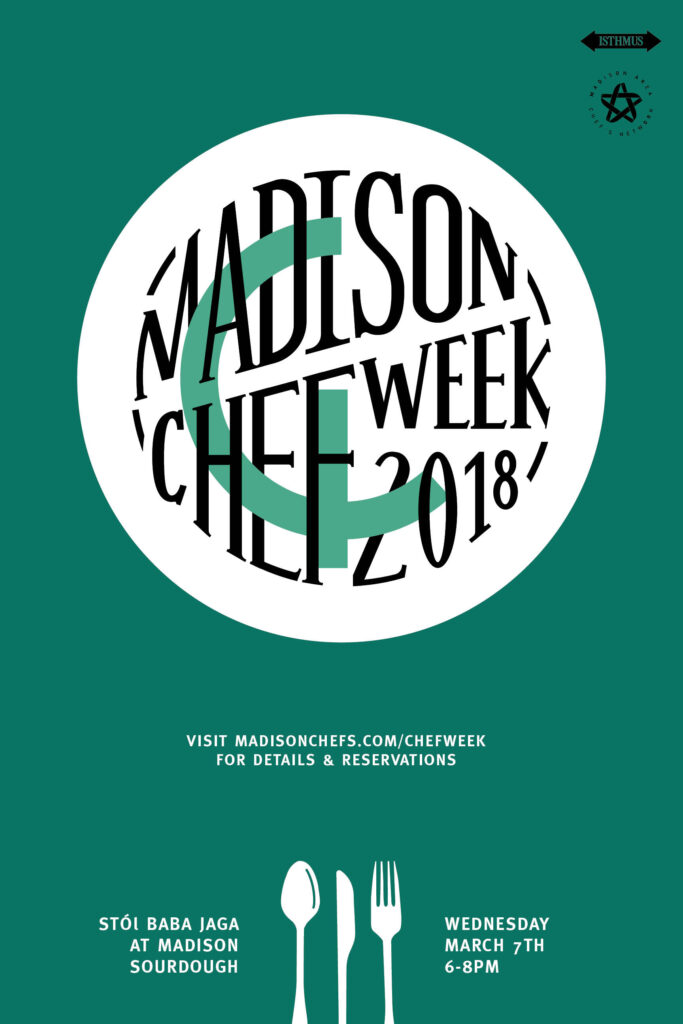
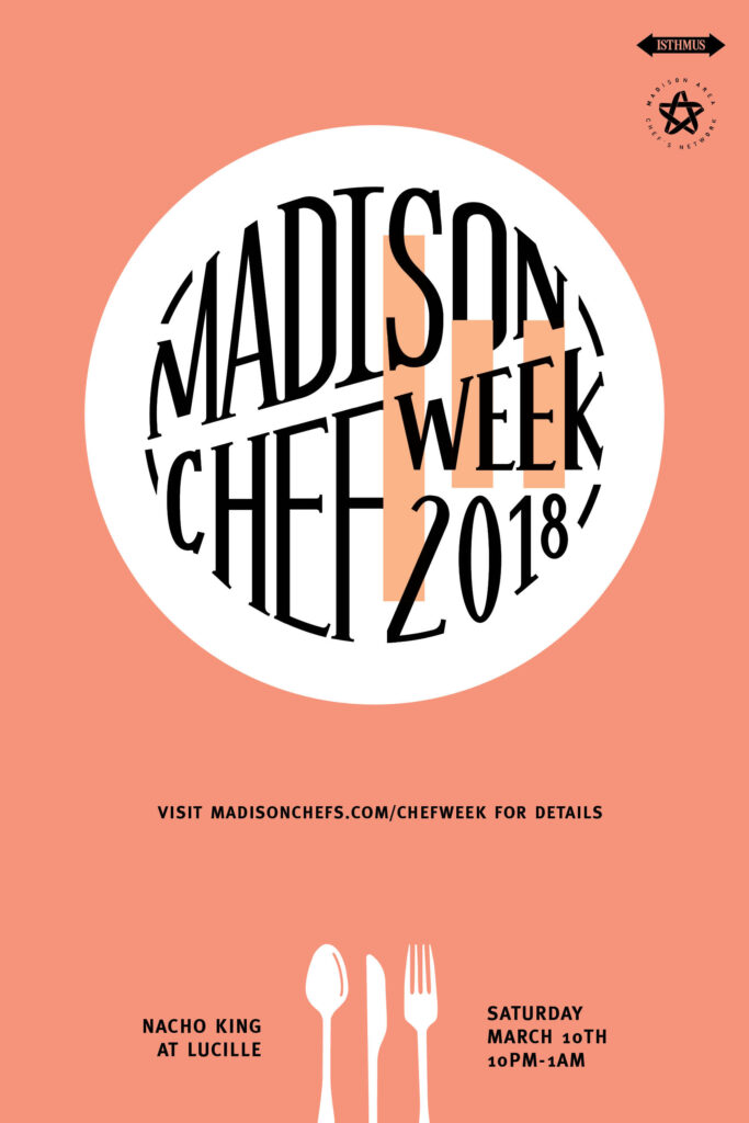
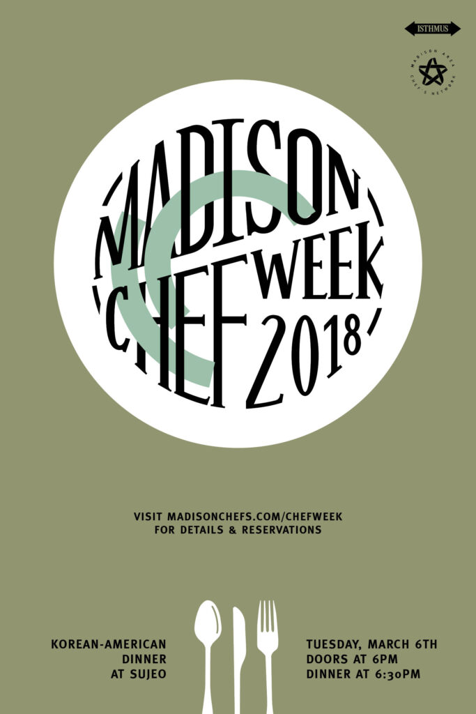
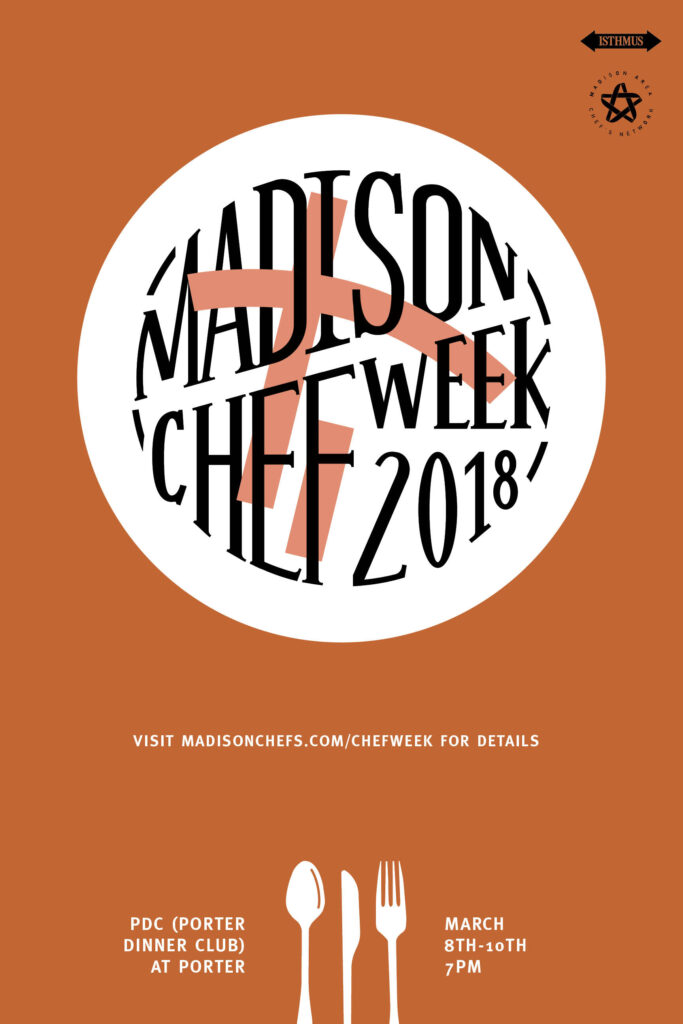
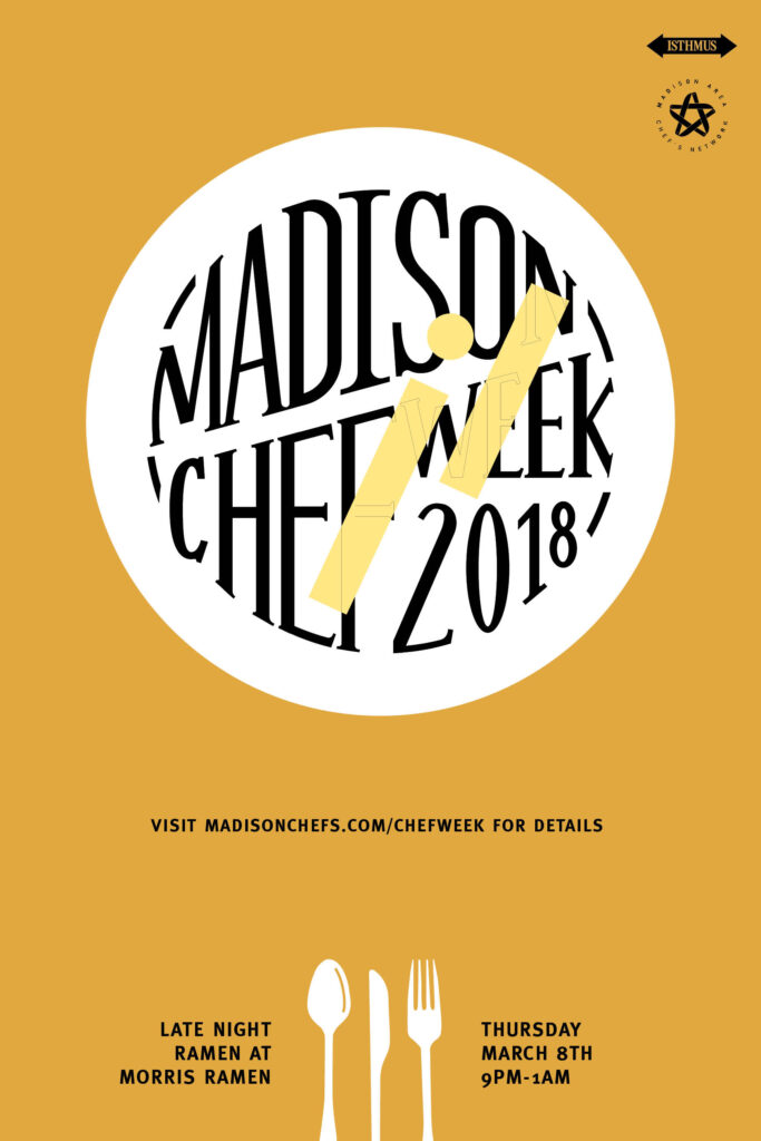
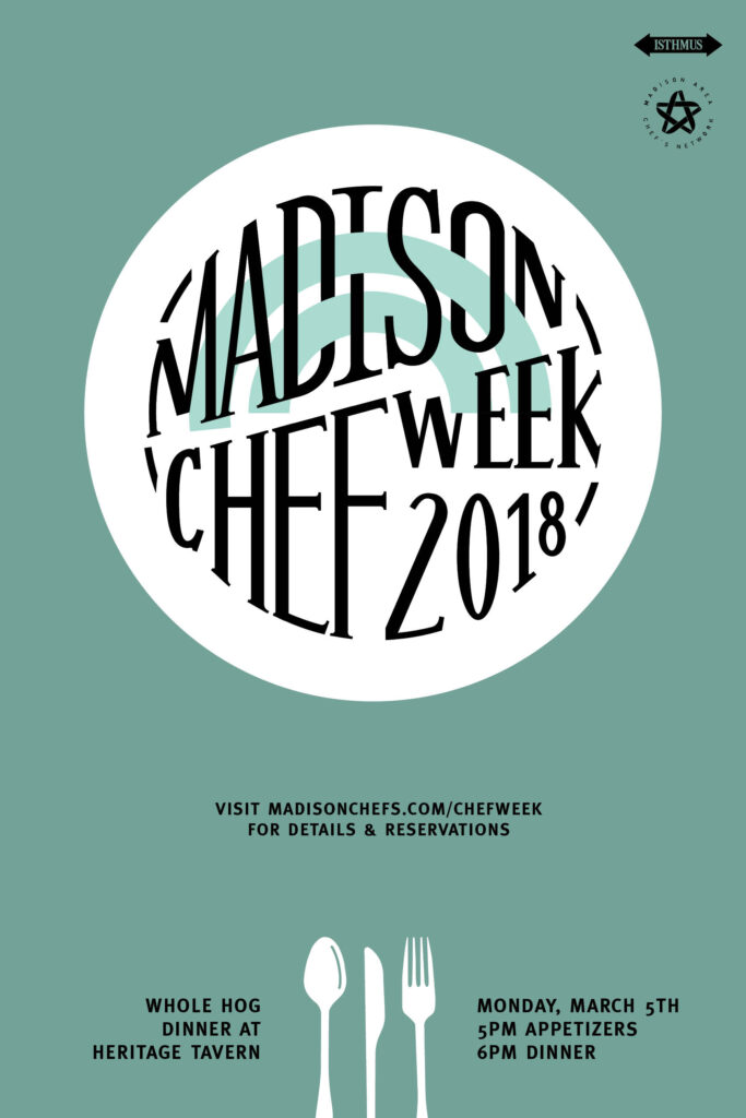
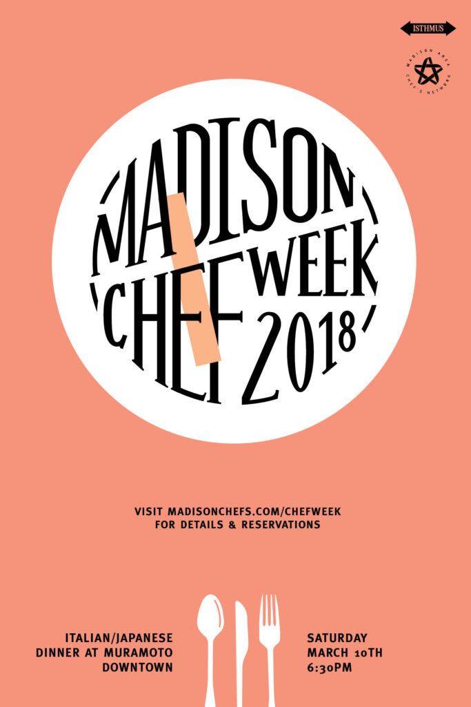
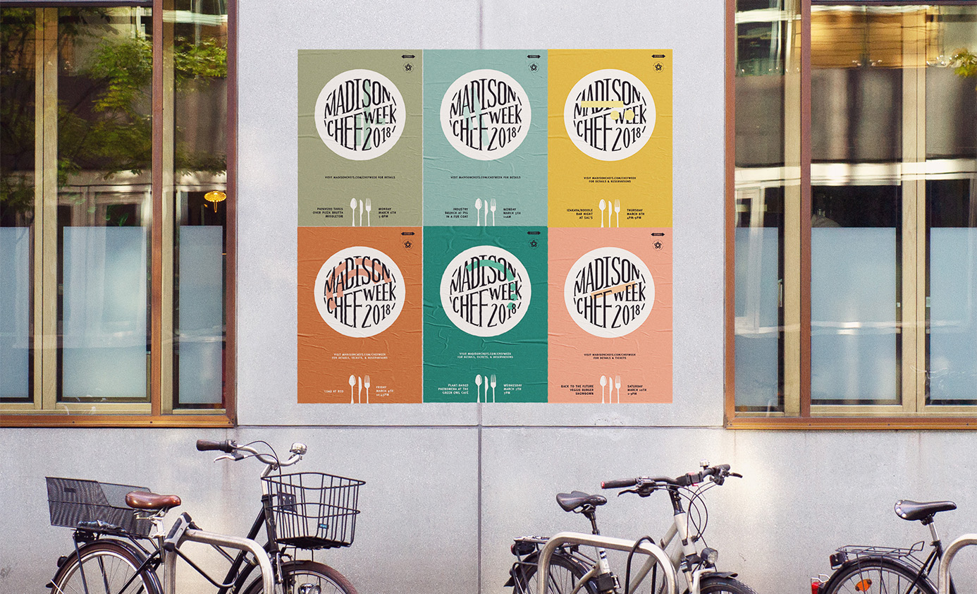
For Madison Chef Week, we wanted to have a consistent mark for the week and every event, while simultaneously differentiating between each one. So I designed a system, inspired by the art of plating food. For each event I created a unique graphic, representing different shapes of beautifully plated food. These simple graphics interweave through the type, lettered in a circle, or the shape of a plate. I also used a different color for each day of the week as a quick visual cue that is carried across the posters, website, booklet, calendar and social media images.
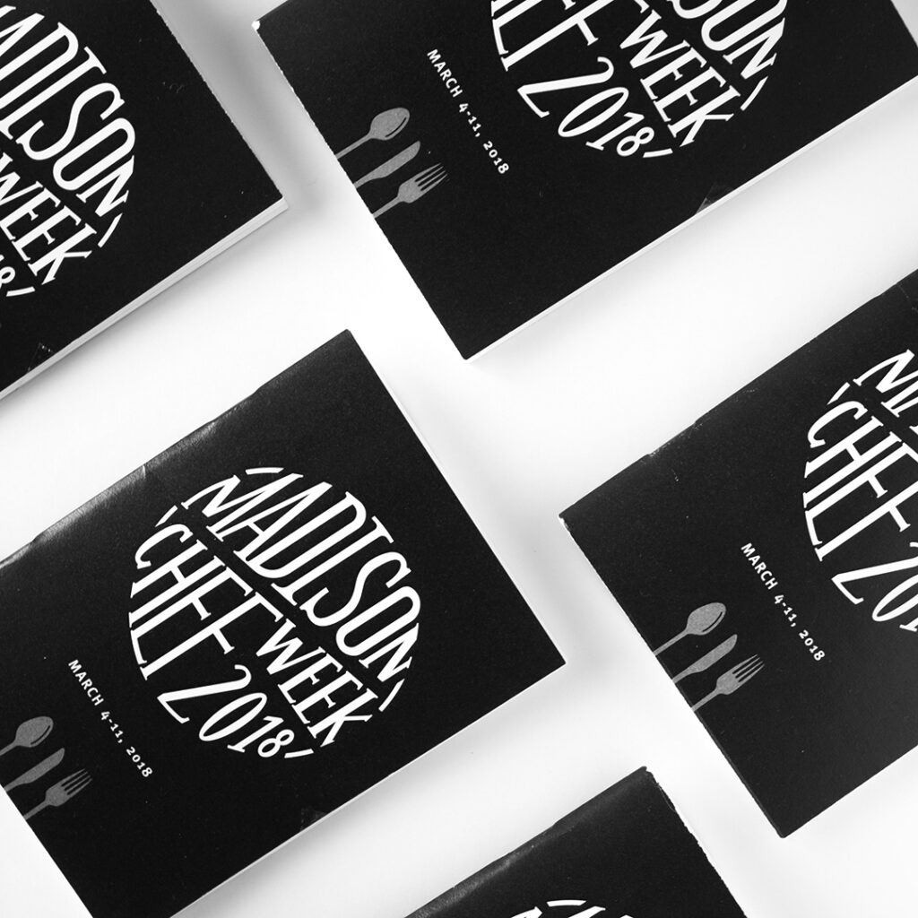
The passport-inspired books were created and handed out at the kickoff event to encourage people get to as many events as they could, where they received a logo stamp over the graphic for the event they attended.
Brand assets I created:
- 26 unique poster designs
- website
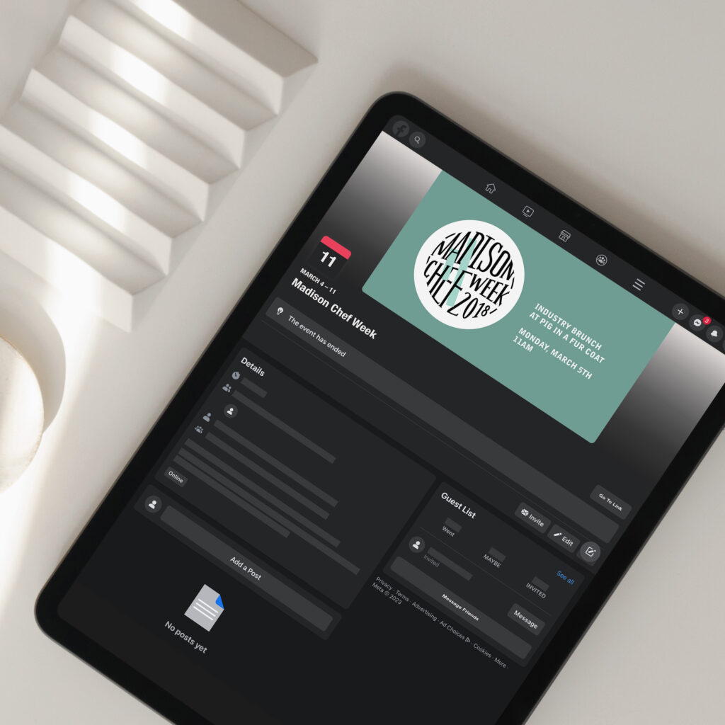
- facebook graphics
- instagram graphics
- print ads
- passport booklets
- stamp
- calendar cards
- tickets
FILED IN:
Clients, Design
SHARE ON: