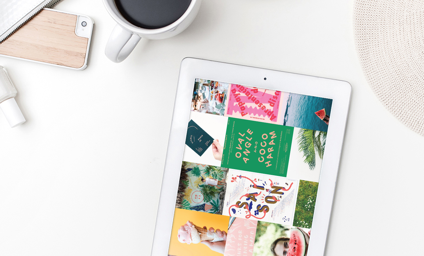
Moodboards play an integral role in my design process as a source of inspiration and storytelling. When I work with a client we begin by digging deep into their vision for the brand as a whole. What tone words exemplify your dream brand? What emotions does the brand evoke in your ideal client?
From the discussion, I pull photography that I feel ties visually to the words provided. It may consist of textures, objects, or full emotive scenes. These visuals then inform elements of the brand. A clean, contemporary moodboard may lead to a san serif font. A lighthearted, playful board may push towards a highly illustrative brand.
The whole process is essentially a series of baby steps from a vision in your head, to words on paper, to a visual feel, to the final perfect brand.
Below I’ve included some examples of past projects and how moodboards have translated in to the final design.
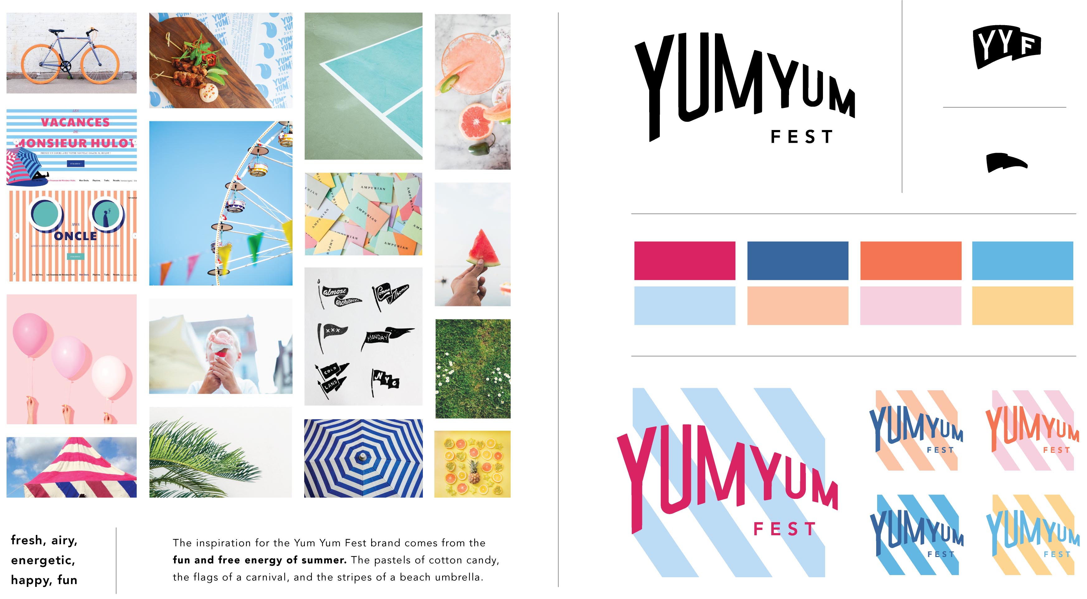
Yum Yum Fest
Yum Yum Fest is a summer food festival so the inspirational imagery consisted of a lot of bright pastels, carnival flags, and striped tents and umbrellas. It all conveyed a very fun and free energy. As a result, in the final brand you’ll see a hand drawn logotype with the energy of a flag. A tool kit of layered, colorful diagonal stripes. And a bright, summery color palette. Check out more of the project here.
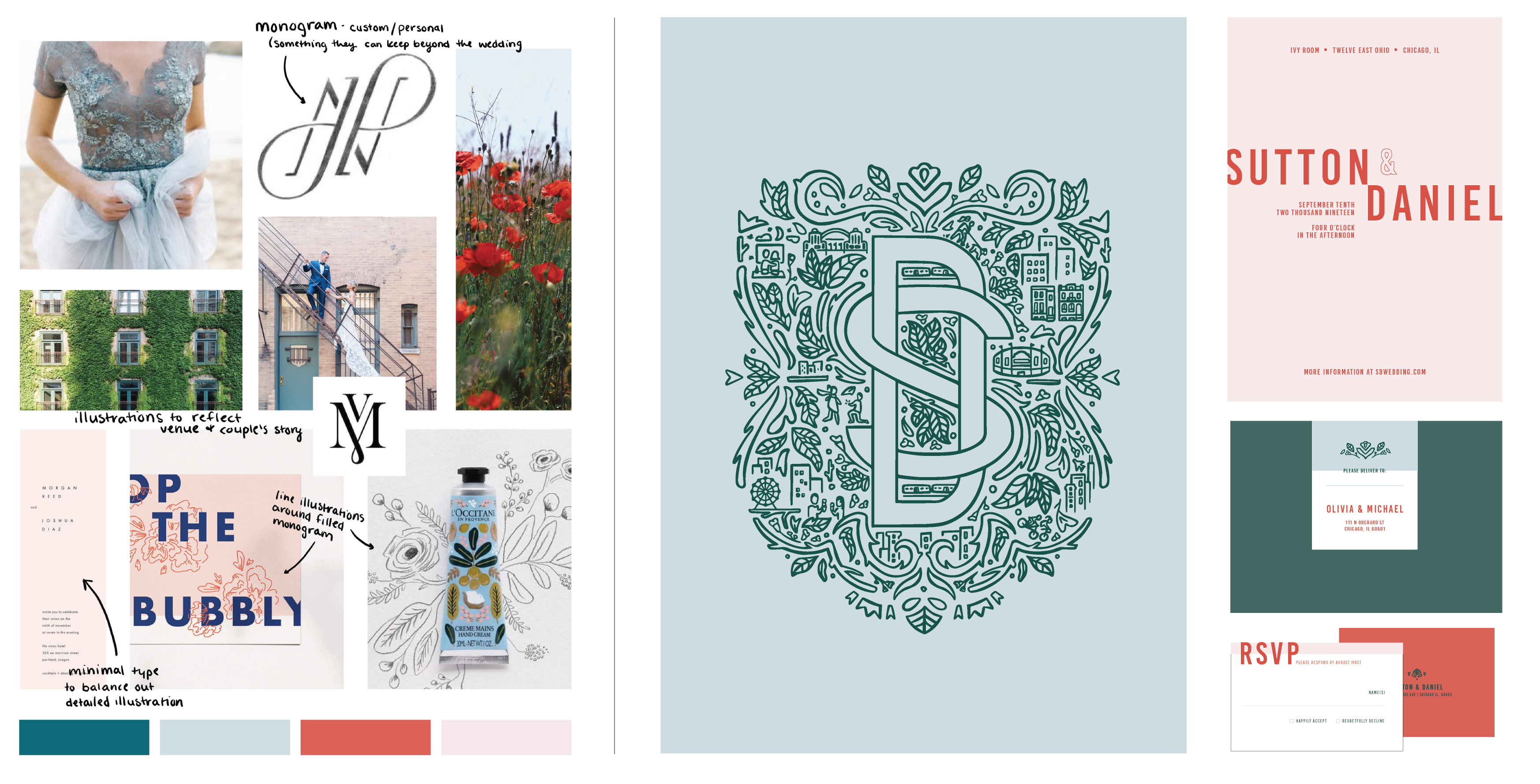
Spring Details Shoot
Going into this style shoot with the incredible photographer, Margaret Rajic, we discussed a vision of a spring wedding with great attention to detail. With this in mind, I pulled unique fabrics, springy pops of color, and intricate illustrations as inspiration. On every moodboard (seen above) I’ll write notes about what I like about each piece of inspiration. By doing this I can understand what elements I’m drawn to and can adapt them in my own way into a new design, rather than accidentally copying them.
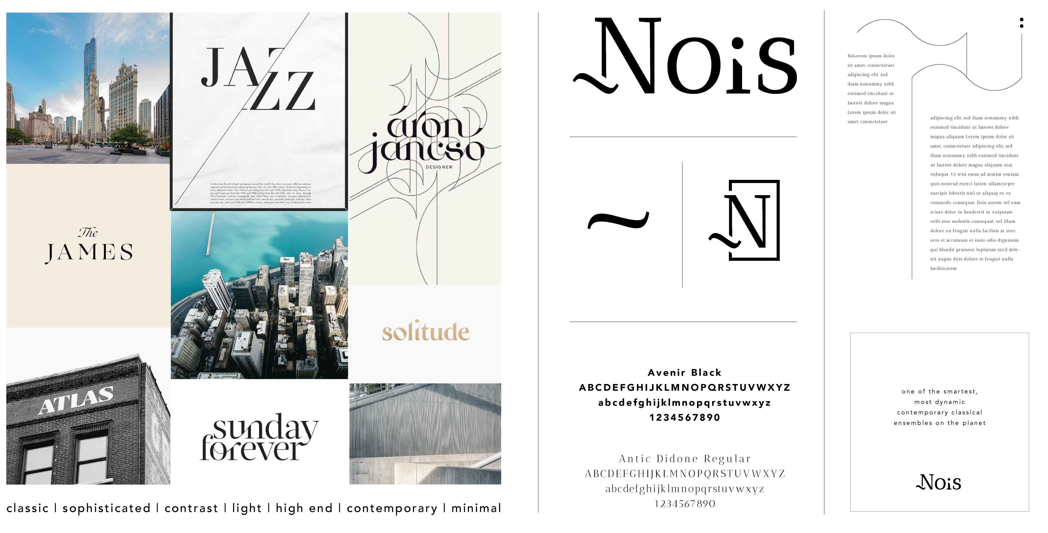
~Nois
~Nois is a saxophone quartet based in Chicago. Their music is contemporary, sophisticated, and experimental so I wanted to create the balance between these ideas through a primarily type based logo. I used a classic san serif as a tie to their Chicago tradition, while creating some interest and experimentation by cutting off the letters to follow the wave in their iconic tilde. Before getting to this final design, however, I used an inspiration board filled with classic Chicago architecture, clean urban lines, and sophisticated typography.
This part of the process is so thoroughly enjoyable to me, filled with endless ideas and exciting directions. To see more final projects and moodboards you can check out more of my work here. Or if you’d like to work together you can learn more here.


FILED IN:
Design, Tips
SHARE ON: