Brooke Ballagh’s brand and website launched this week! Brooke is a yoga instructor, full of energy and positivity, and I’m so excited to be sharing the designs for her yoga blog.
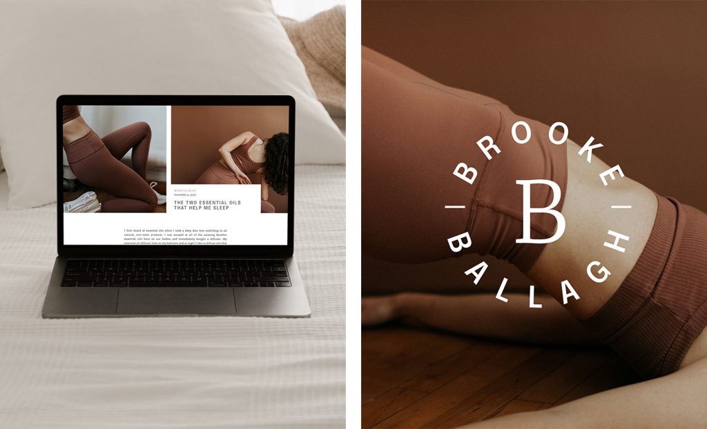
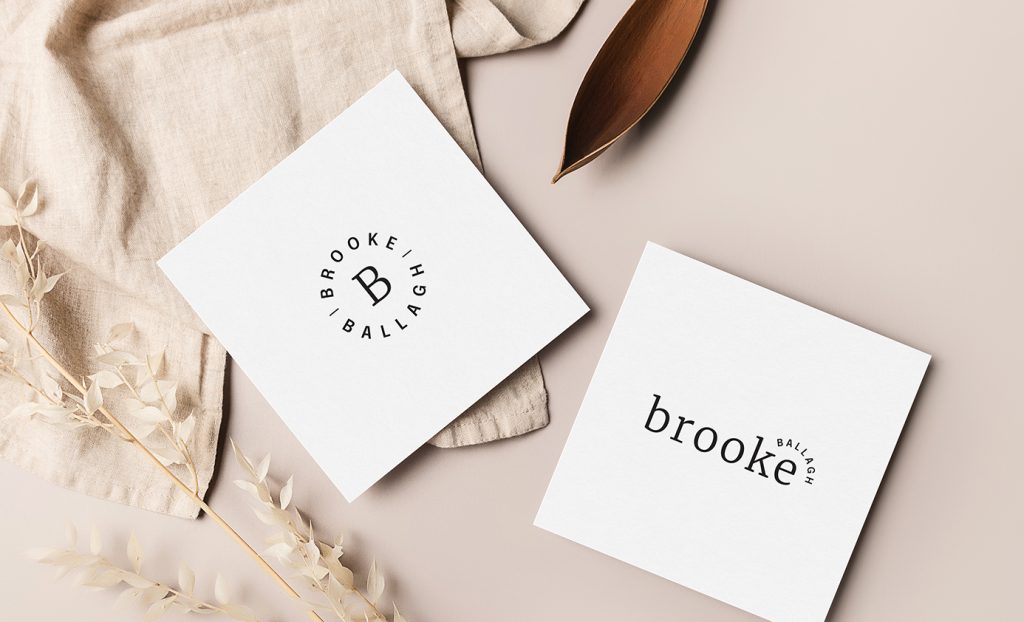
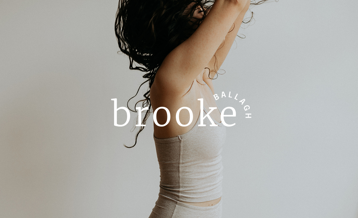
Through the design of her personal brand and website we wanted to create an experience that feels inclusive, upbeat, and human. To do this we pulled together a color palette earthy and natural tones. In the typography we utilized a friendly serif contrasted by a thin uppercase san serif. This, combined with the playful curve of “ballagh,” feels carefree and energetic, just like Brooke herself.
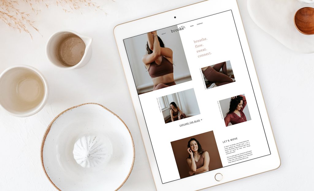
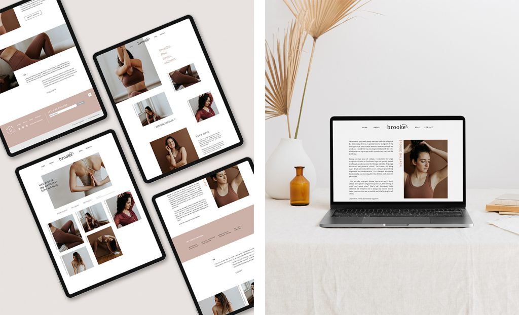
The website was created with layouts that feel very fresh and contemporary, featuring plenty of white space and playful vertical type. The simplicity is meant to create a site that is refreshingly easy to navigate and enjoyable to experience. Color is pulled primarily from the photography, leaving the other elements feeling very minimal and high end. Working with the incredibly talented Alisha Tova, Brooke’s photography follows a minimal and natural style with organic movement and minimal backgrounds.
Overall, this collaboration resulted in a beautifully fresh yoga blog experience. Check out her posts and live site at brookeballagh.com.
Photography by Alisha Tova
Mockups from Moyo Studio
You might also like:
FILED IN:
Clients, Design
SHARE ON: