re|Born
April 6, 2021
April 6, 2021
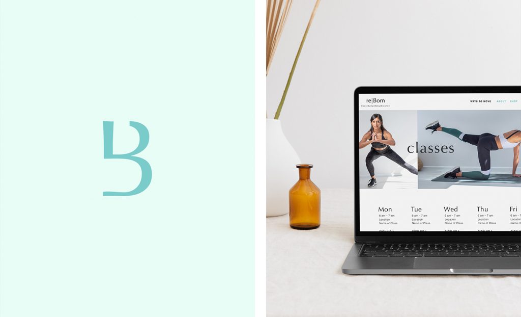
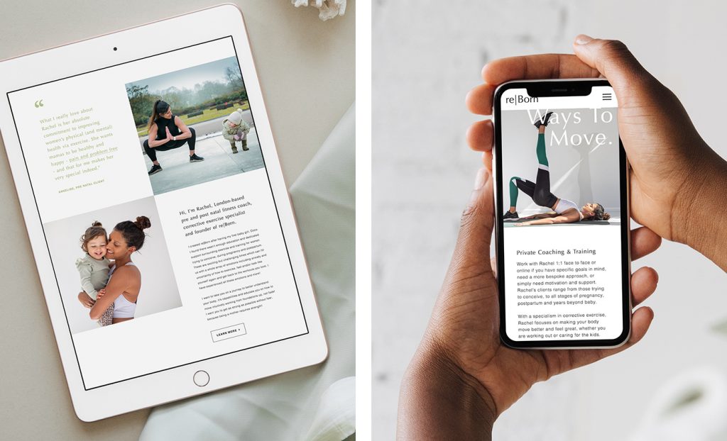
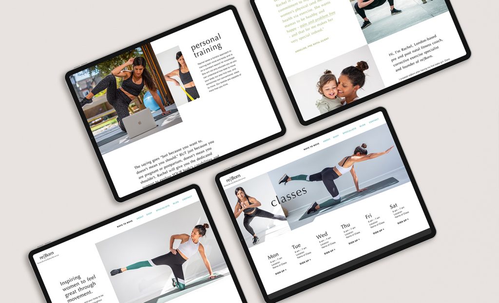
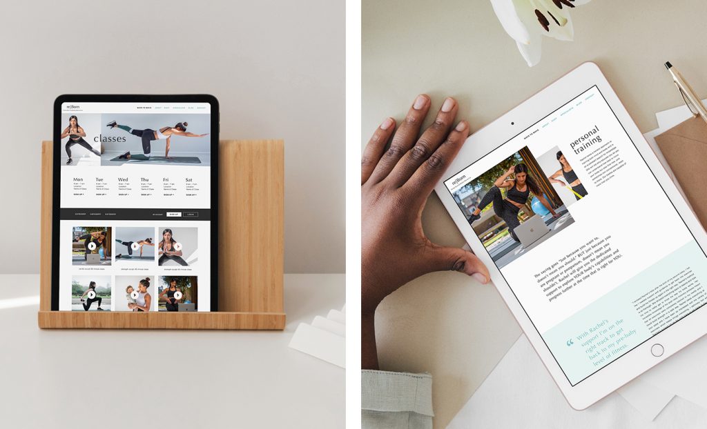
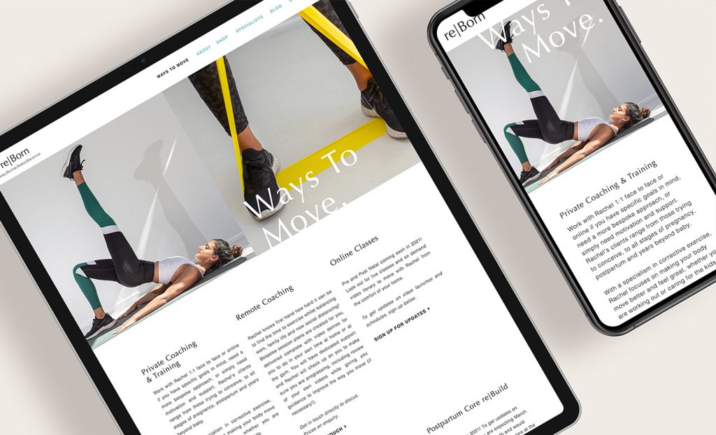
It was so fun to work with Rachel, a London-based women’s fitness coach, pre and post-natal specialist, and founder of re|Born. We launched a brand new website for her brand to communicate the array of offerings she has available for pregnant and postpartum women.
For re|Born’s website we focused on creating unique layouts that utilize white space to create a professional, welcoming, and uplifting feel. We wanted to create a refreshing vibe as a reflection of re|Born’s unique, holistic approach to pre & postpartum wellness. We also teased a bit of what’s to come to the site with live classes and a video library!
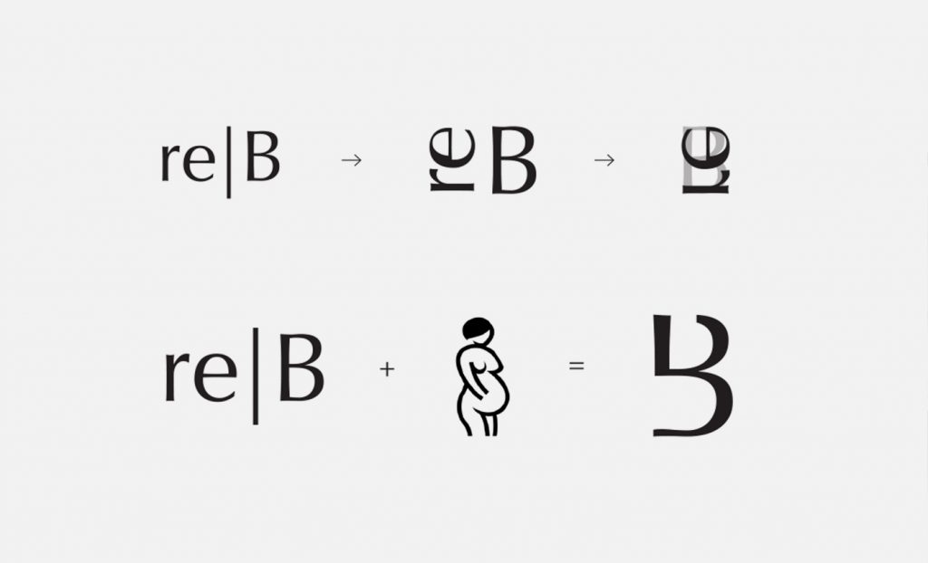
In order to expand re|Born’s existing branding I created a concept for the submark that contorts the consistent “re|B” of the brand (re|Born, re|Bump, re|Baby, etc) into a more simplified mark. The curves of the mark subtly mirror the silhouette of a woman’s curves to tie in the brand’s mission.
Check out the live site at rebornactive.com.
Mockups from Moyo Studio
You might also like:
FILED IN:
Clients, Design
SHARE ON: