Although I may not be a professional photographer, I’ve received photos for web design clients enough times to know what is best to work with when it comes to creating a website. Quality photography is crucial for a professional, high-end site. I can only make a design look so good if the photos are bad.
So for the instances where I can’t recommend a photographer or give art direction on a shoot, here are some tips for you to ensure you have a dynamic website that attracts new clients.
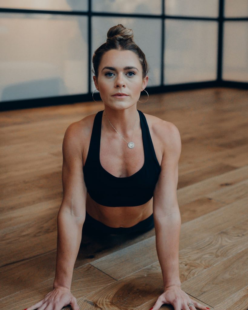
Energy
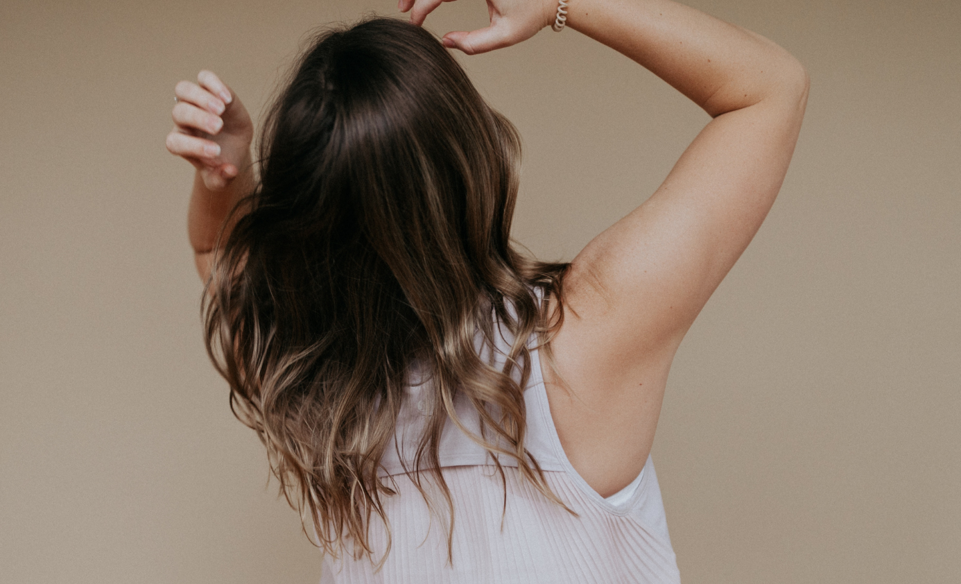
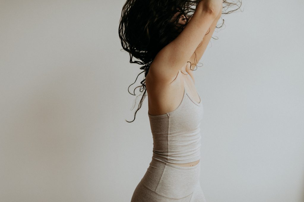
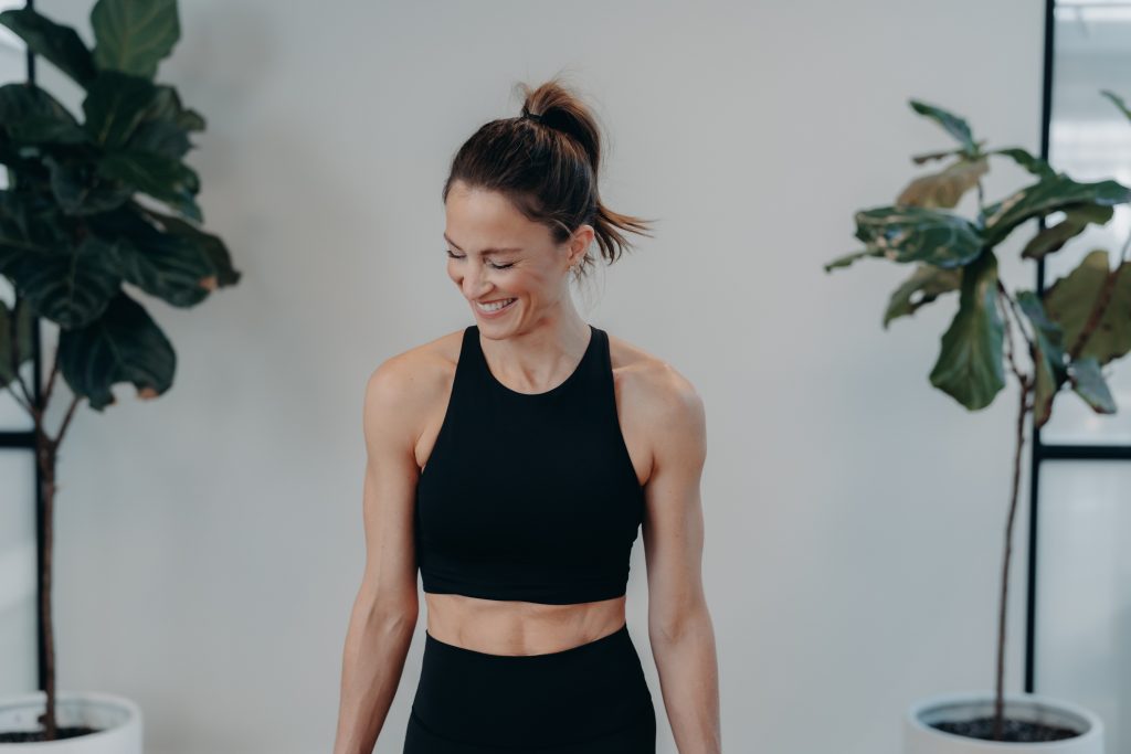
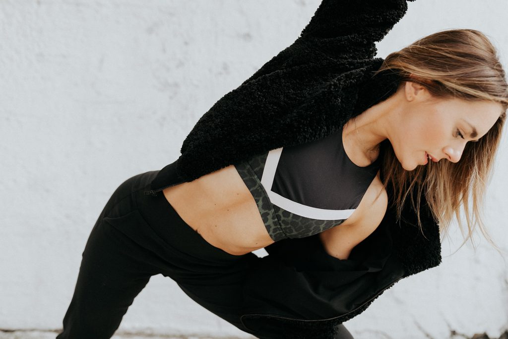
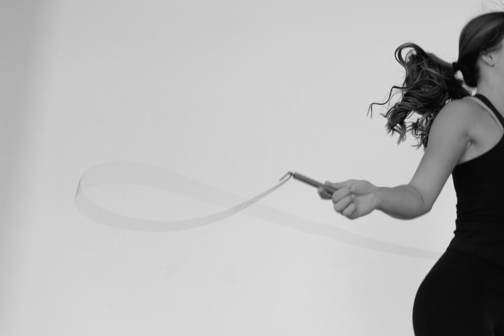
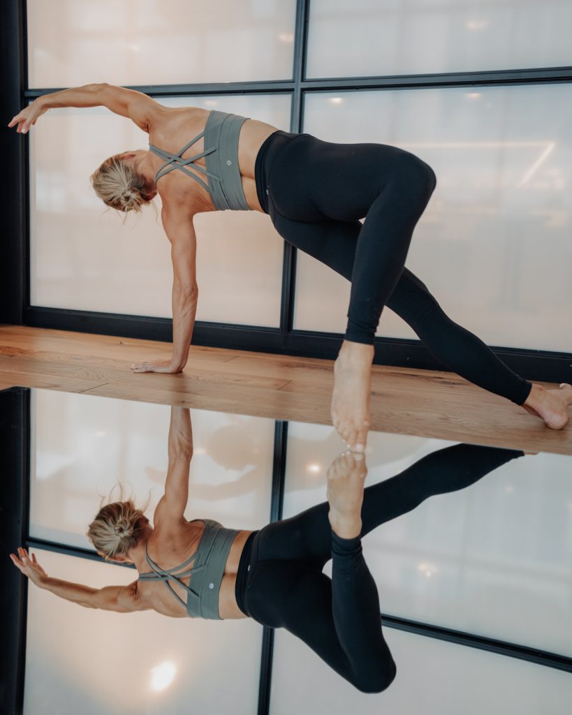
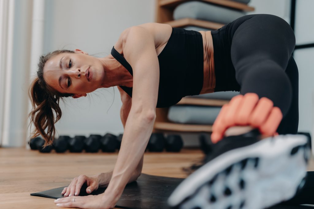
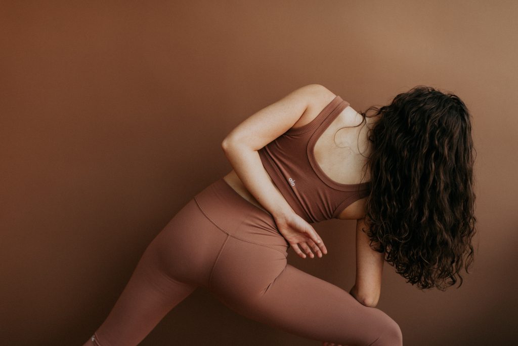
This first quality is something I always look for when recommending photographers because I think some are better at capturing it or know how to encourage it better than others. It’s also the hardest to explain. Through the photos I want to be able to feel the movement, breath, laugh of the subject of the photo, especially when it comes to fitness photography. At the photoshoot you’ll be continuously flowing through moves, probably repeatedly, to capture these kinds of shots. This could just be shifting your weight between your feet or maybe it’s transitioning between yoga poses. Whatever your pose, it shouldn’t be one you’re holding for five minutes.
Variety
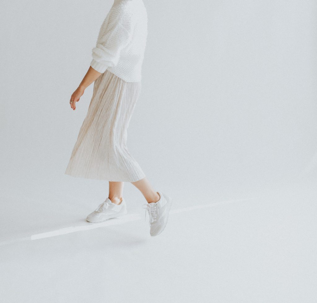
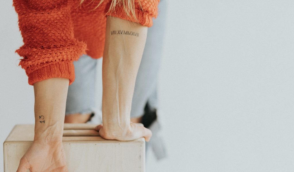
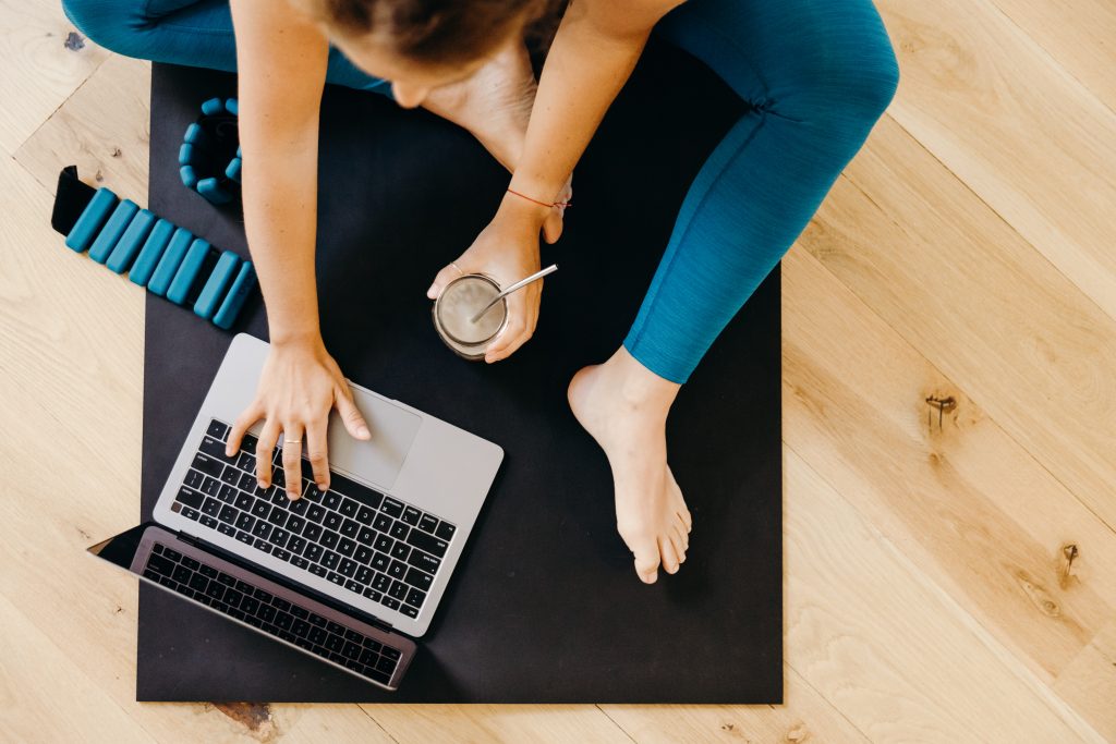
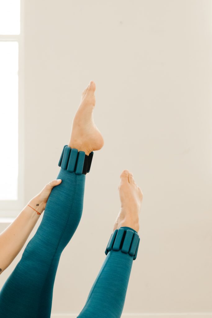
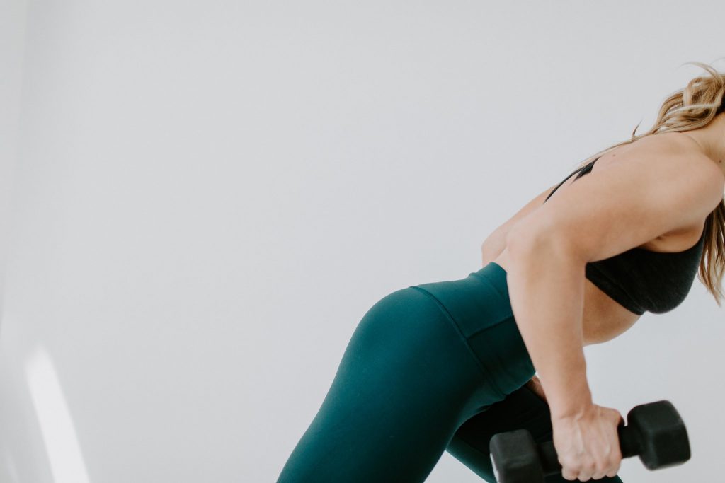
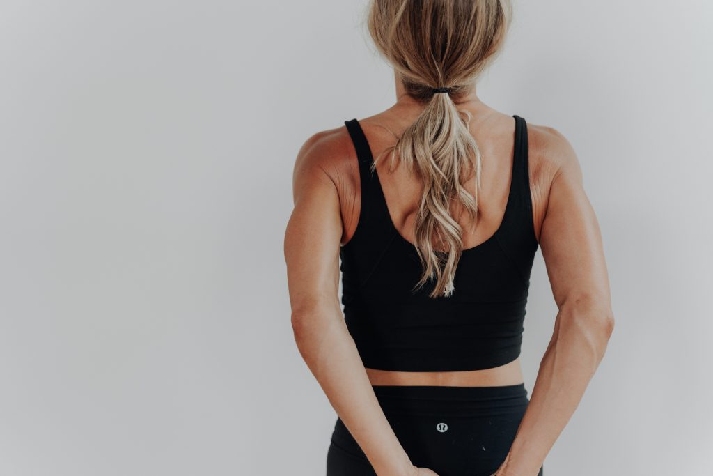
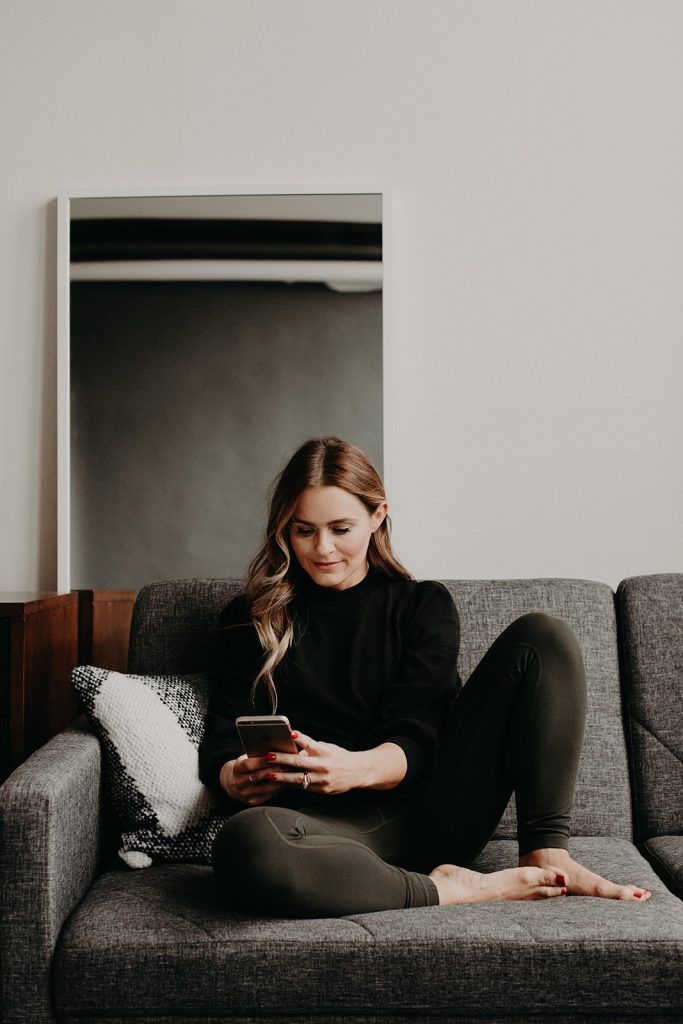
Energy may be the thing I look for first in photographers, but variety of photos is probably the biggest factor that takes a website from a basic nice looking site to one that feels dynamic and intriguing. Variety in clothing and background makes it less obvious that all your photos were taken in one shoot, which also makes it feel more real, like someone isn’t only seeing you from one moment in time. Even more importantly, variety in the angles and cropping creates interest as you scroll through a site. As you can imagine, seeing your face, as lovely as it may be, over and over again in every photo can feel repetitive. We want full body shots as well as photos cropped in on your hands touching your toes in a stretch, your back in a pushup, or your shoes jumping off the ground (to name a few examples).
Negative Space
Having white space in photos is super helpful as a designer because it gives so much more flexibility to the website layout. A background that is either simple or out of focus allows room for text or other elements to overlap the photo. This allows for less block-like layouts and more of a flow through the site.
Note: I’d recommend avoiding brick backgrounds for the majority of your photos as that can be a lot of texture, pattern, and a strong color even though it seems simple.
Consistency
This may seem counterintuitive to the variety tip, but while I do believe you should have variety in your clothing and angles, your photo aesthetic should be consistent across your brand. It’s definitely possible to use photos on your website from different shoots and events, but make sure the editing is somewhat consistent across them. The primary factor you want to consider is the color. Photographers all have their own editing style, so I would just avoid combining photos that have much cooler tones with ones that are edited to be warmer.
I literally get giddy when I receive website photos that have these qualities, because I know we’ll be able to create the most gorgeous (and effective) website together. Photography is key.
And once you have the shots, pick out a website template from the site shop to bring it all together.
Other Photoshoot Tips
- MOST IMPORTANT- ask your photographer to get a lot of landscape oriented photos (these work best for websites- if you try to place a portrait oriented photo into a landscape spot that spans the width of the screen it is going to be very cropped in on your face)
- What you wear will have a big impact on the colors so think about your brand color palette when choosing your outfits (you don’t have to wear every color in the palette, but try not to wear any bold colors that aren’t in your palette or that will become a part of your palette).
- You’ll probably feel a little uncomfortable at first, but once you get into it the nerves will go away! Just go through some fitness moves that feel natural to start. The photographer will likely have experience making you feel at ease as well.
You might also like:
- 8 Tips for an Effective & Profitable Website
- The 5 Biggest Website Mistakes That Are Costing You Clients
- Features to Include on Your Website As A Fitness Pro


FILED IN:
Design, Tips
SHARE ON: