Luxury Wellness Branding: The Strategic Brand Identity Behind Private Pilates Studio, PilatesPrivé
In the competitive world of fitness and wellness, Pilates branding has become increasingly sophisticated as studios seek to differentiate themselves in a crowded marketplace. The brand identity created for PilatesPrivé, a luxury private Pilates studio in Greenwich, Connecticut, exemplifies how thoughtful Pilates studio branding can communicate exclusivity, wellness, and personalized care through every visual touchpoint.
The Foundation: Understanding the Vision
Before diving into the visual elements, the PilatesPrivé brand identity was built on a crystal-clear vision: to be known for luxury, high quality private Pilates that helps people feel strong, confident, and capable in their bodies while experiencing the pinnacle of personalized wellness in an exclusive, beautifully designed environment.
This mission statement became the North Star for every design decision, ensuring that the brand would attract clients seeking premium, personalized wellness experiences rather than competing in the mass-market fitness space.
Crafting a Sophisticated Brand Personality
The brand personality for PilatesPrivé strikes a careful balance: sophisticated and exclusive, yet positive and nurturing—never intimidating or pretentious. This positioning is crucial in Pilates studio branding because it addresses a common challenge in the luxury wellness space: conveying premium quality without alienating potential clients who might feel intimidated by overly exclusive messaging.
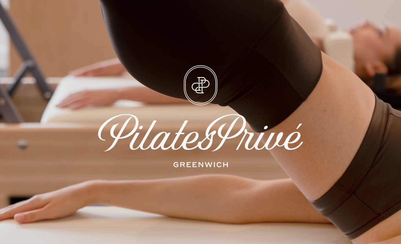
The Visual Identity: Every Detail Matters
Logo Design Strategy
The PilatesPrivé logo system demonstrates sophisticated Pilates branding through its multi-faceted approach:
Primary Logo: Features a customized, sophisticated script with high-contrast strokes and refined curves that immediately communicate luxury and elegance. This styling helps the brand stand out from the simple, sans serif logos commonly used by competitors in the area.
Contemporary Typography: The script is complemented by a contemporary, expanded sans serif that adds clean, premium simplicity to the overall identity.
Flexible Brand Marks: The comprehensive logo system includes multiple variations ensuring consistent brand application across all touchpoints while maintaining flexibility for different use cases.
The Power of Symbolism
The brand’s icon features flowing and interlocking curves made from the P’s that represent the mind-body connection, movement, and the exclusive community circle. This thoughtful symbolism reinforces the brand’s core values while creating a memorable visual element that works at any size.


Color Psychology in Pilates Branding
The color palette for PilatesPrivé demonstrates how strategic color choices can elevate Pilates studio branding:
Neutral Foundation: The palette utilizes clean, muted tones and soft light that feel welcoming, clean, and elevated. This approach avoids the bright, energetic colors common in fitness branding, instead opting for sophistication.
Restrained Luxury: By leaning into neutral tans and whites, the brand evokes a sense of restrained luxury that attracts the ideal high-end clientele.
Strategic Color Names: Each color has been given a sophisticated name (Cashmere, Mocha, Latte, Stone, Pearl, Dove, Charcoal, Ivory) that reinforces the premium positioning and makes the palette more memorable for brand applications.


Photography Direction: Visual Storytelling
The photography direction for PilatesPrivé demonstrates how Pilates studio branding extends beyond logos and colors:
Detail Shots: Focusing on cropped body angles, equipment details, and premium studio features creates intrigue and emphasizes the high-end experience.
Studio Atmosphere: Wider shots showcase both the workout quality and the aesthetic environment, recognizing that the studio’s design is itself a selling point.
Personal Connection: Including shots of hands-on assistance emphasizes the focused 1:1 attention that justifies the premium positioning.


Key Takeaways for Pilates Studio Branding
The PilatesPrivé brand identity offers several lessons for effective Pilates branding:
- Clear Positioning: Define exactly what makes your studio different before designing anything visual
- Thoughtful Minimalism: Premium doesn’t mean complicated—refined minimalism often communicates luxury more effectively. Achieving this sophisticated simplicity requires careful consideration of every design element
- Comprehensive Systems: Invest in a complete brand system that works across all applications
- Color Psychology: Choose colors that attract your ideal client, not necessarily what’s trending in fitness
- Consistent Experience: Every touchpoint should reinforce your brand promise
Conclusion
The PilatesPrivé brand identity demonstrates how thoughtful Pilates studio branding can elevate a business above the competition. By focusing on sophisticated visual elements, strategic color choices, and comprehensive brand guidelines, the studio positioned itself as the premium choice for discerning clients seeking personalized wellness experiences.
In an industry where many studios compete on price or convenience, PilatesPrivé’s branding strategy creates a clear value proposition: this is where you come for the pinnacle of personalized wellness. The brand identity doesn’t just look premium—it communicates a complete experience that justifies and supports premium pricing.
For Pilates studio owners looking to differentiate their business, the PilatesPrivé approach shows that investing in sophisticated Pilates branding isn’t just about aesthetics—it’s about creating a strategic advantage that attracts the right clients and supports sustainable business growth.


FILED IN:
Clients, Design
SHARE ON: