Every brand and website launch is just as joyful as the last, and Rae Arete was no different. Rachel is a Boston-based personal trainer and nutrition coach. She works with busy professionals to create sustainable fitness routines that fit within their lives and schedules.
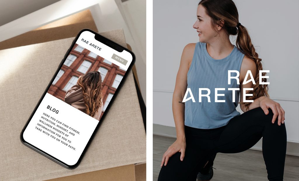
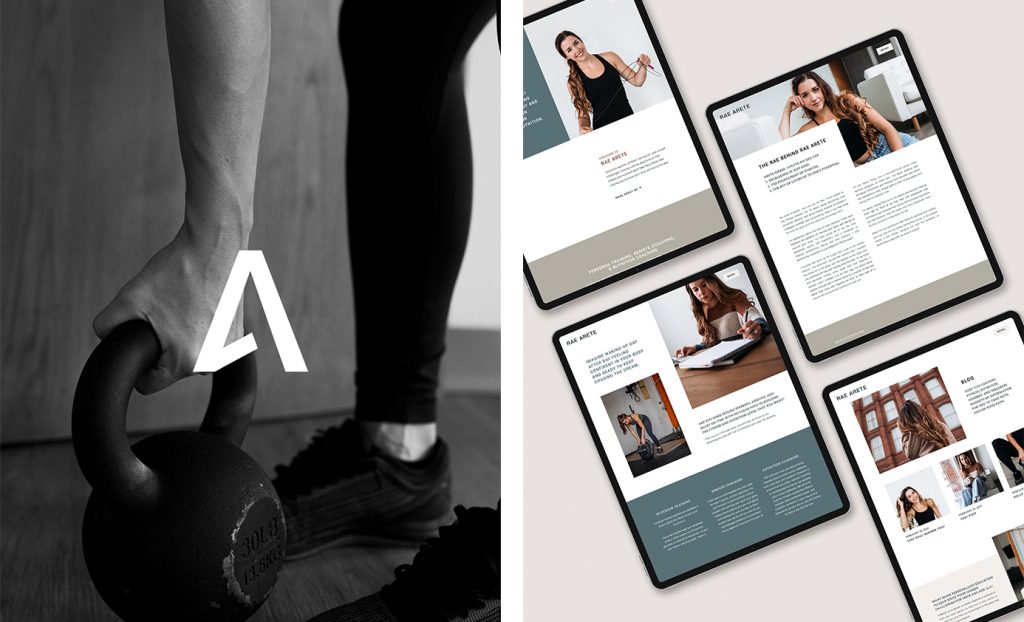
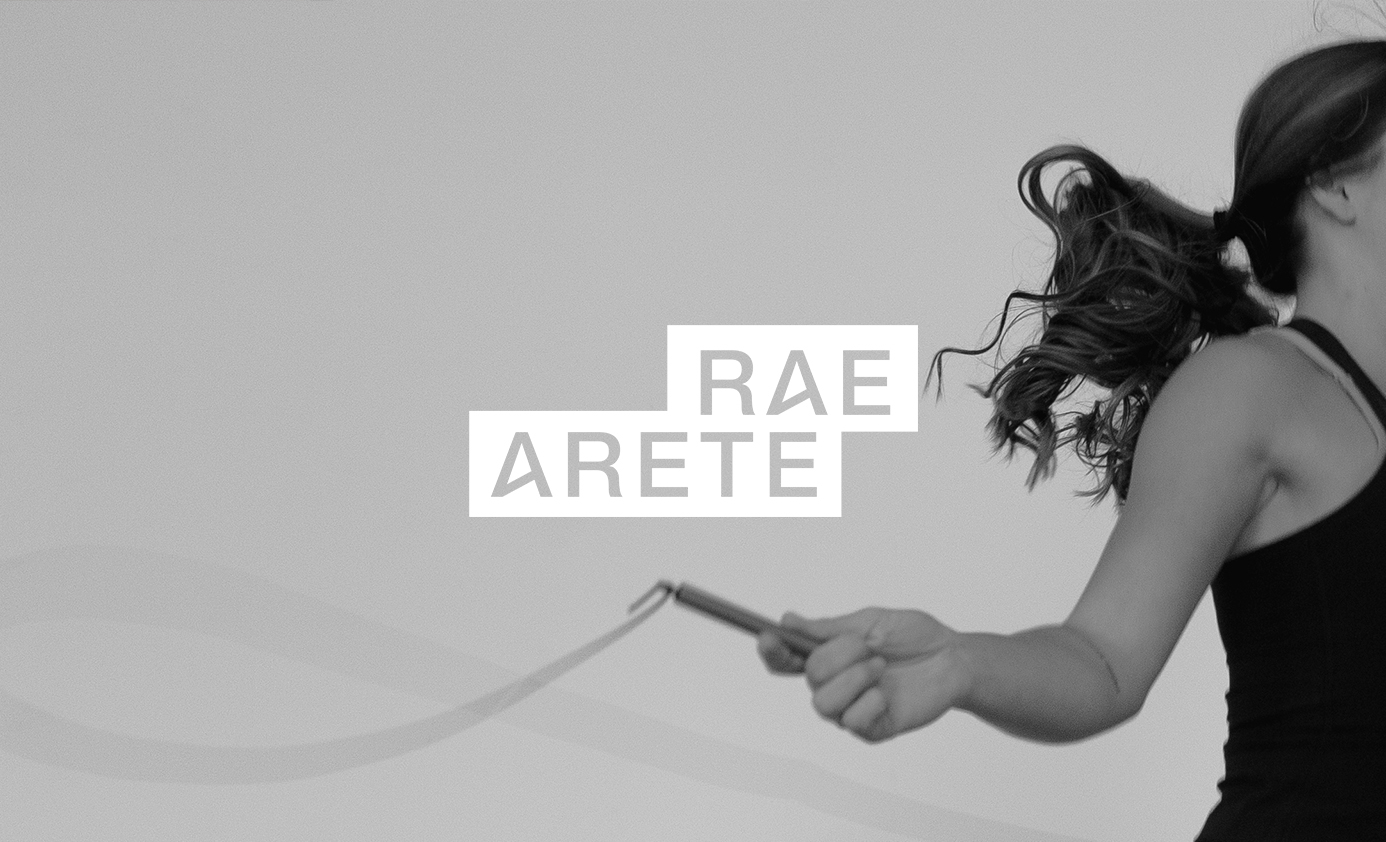
When creating the branding for Rae Arete, I pulled inspiration from a Greek version of Alpha. Arete being a Greek concept, I wanted to subtly reference that in the logo as well as the mountain-like nature of the letterform, representing excellence and a reaching of peak potential. The bold san serif combined with block elements throughout the brand conveys a young, sporty energy without feeling too serious or snobby.
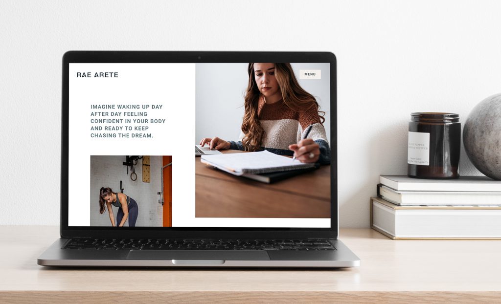
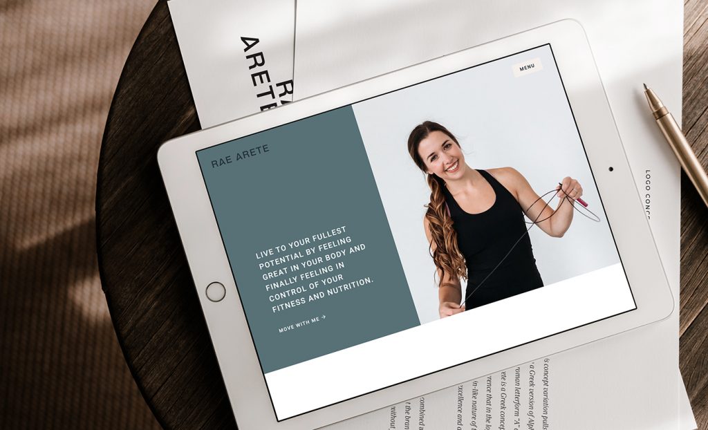
To design the semi-custom website we started with my Sante website template as a base. From there we pulled in her brand elements, colors, fonts, and photography to create an on-brand, approachable, and gritty-yet-elevated tone.
Working with Rachel was a pleasure and I can’t wait to see where she takes her new brand!
Photography by Elizabeth Joy Sanders
Mockups from Moyo Studio
You might also like:
FILED IN:
Clients, Design
SHARE ON: