
Sharp Pilates
January 18, 2024
January 18, 2024
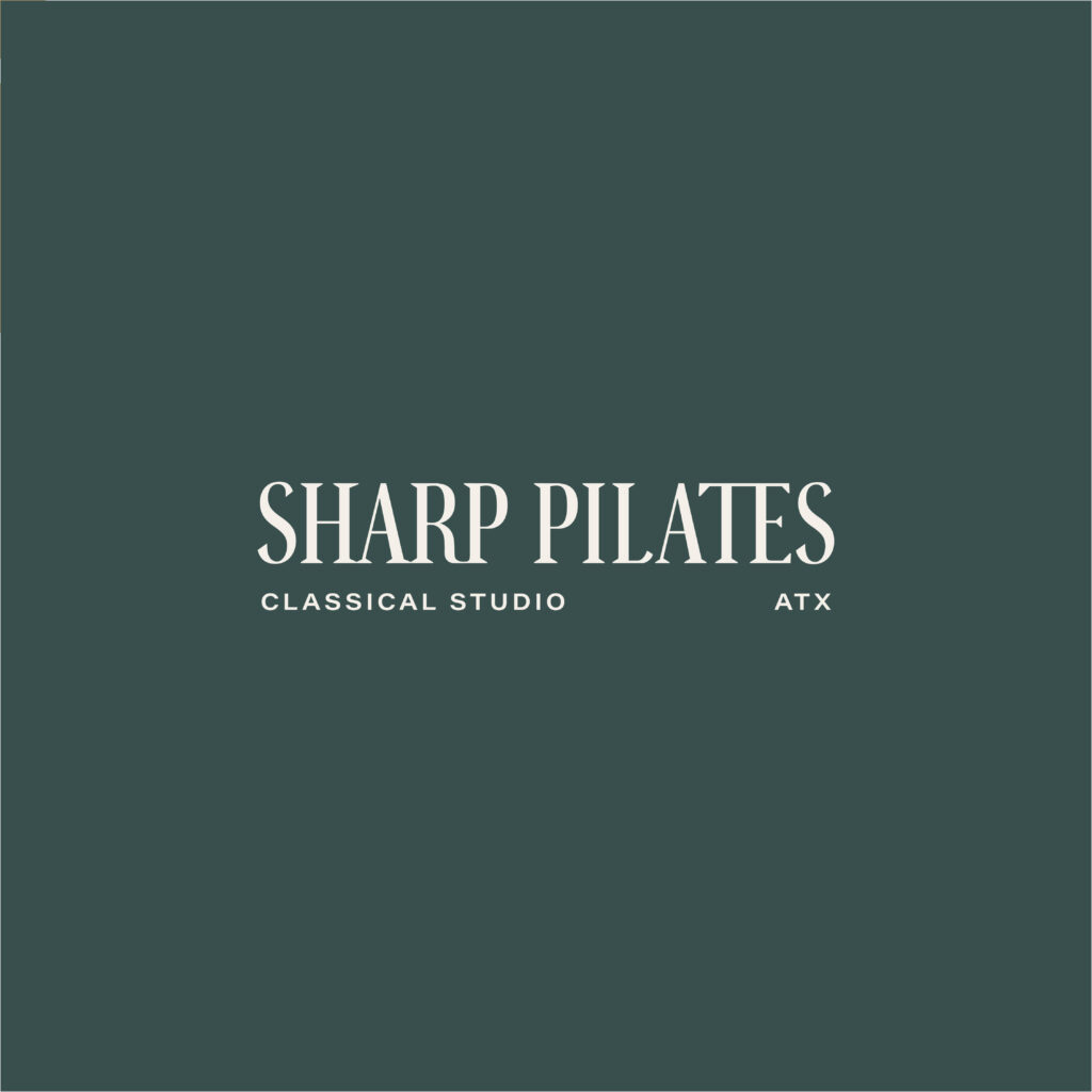
I’m so in love with the way this rebrand turned out for Sharp Pilates! This Austin-based classical pilates studio has created an amazing, supportive environment that pushes boundaries and celebrates progress without inducing negative self-perception.
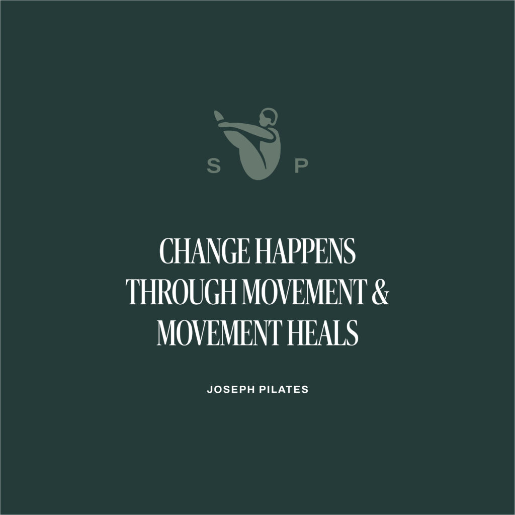
Their new logo uses customized letterforms with unique and contemporary geometric shapes to reflect the many forms seen and created in the studio. A tall serif font in all caps feels sophisticated, high-end, and a contemporary take on a classic form. A minimal, wide sans serif balances and contrasts the primary serif font and adds a more contemporary element.
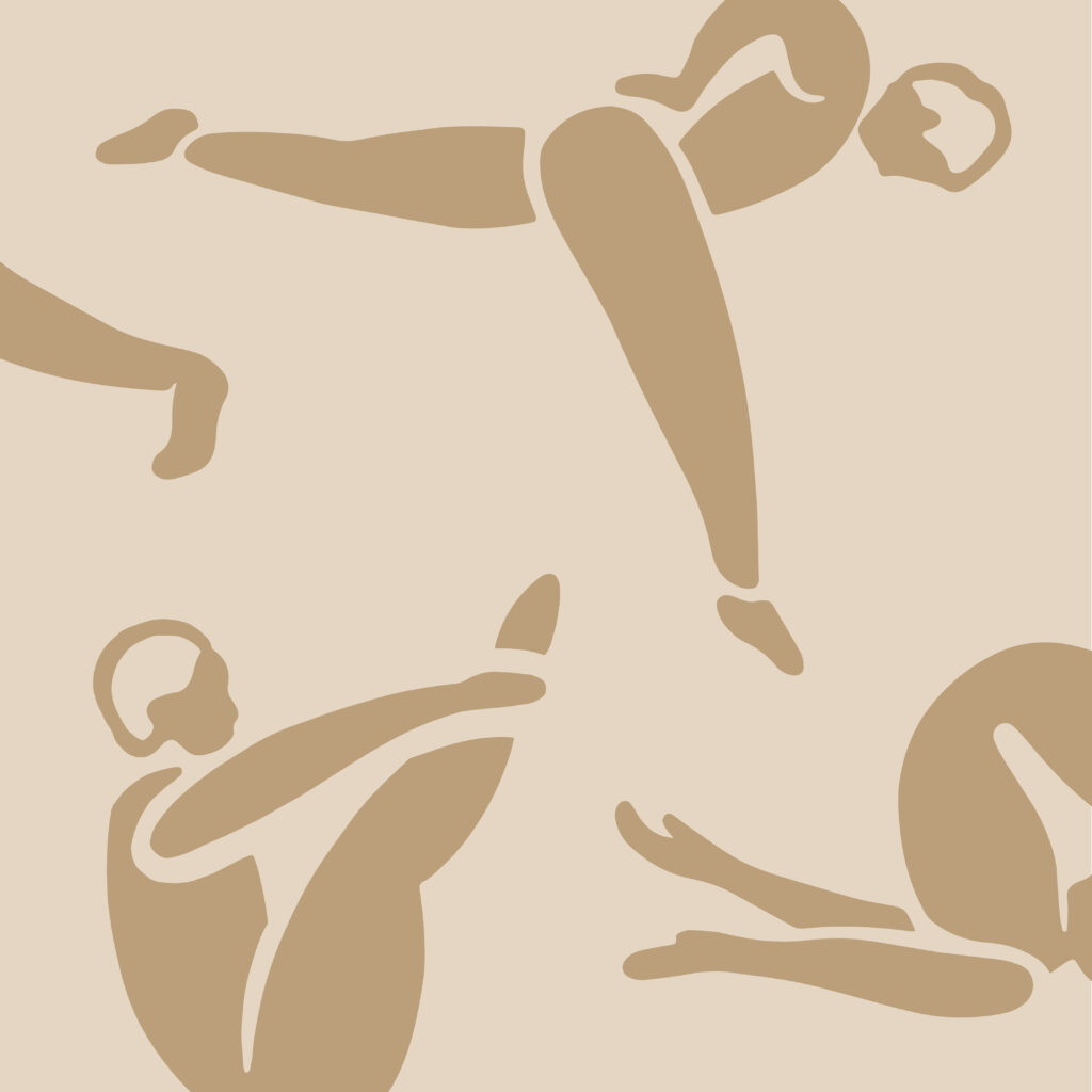
The playful illustrations create a personality that aligns with other local brands their audience loves. And this color palette breaks the norm with a combination that feels warm and welcoming with personality and depth.
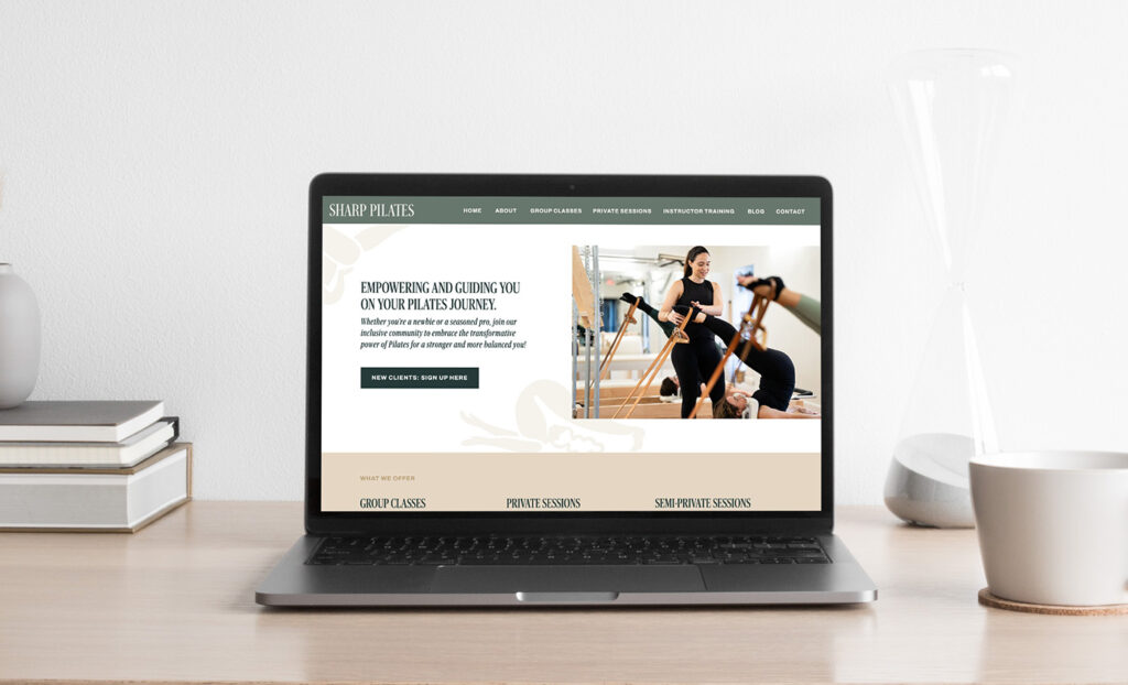
In this website redesign we focused on:
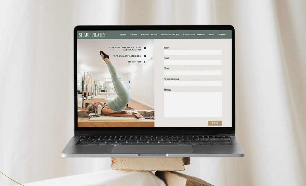
- Creating a super clear path to booking a class. We used multiple call-to-actions driving to the booking page to prevent many unnecessary emails and potential client drop off.
- Highlighting the benefits of class. Not only did we want to communicate to potential clients what they can expect from class, we also want to stand out from other studios in the area by highlighting what makes the classical Pilates practice unique and beneficial.
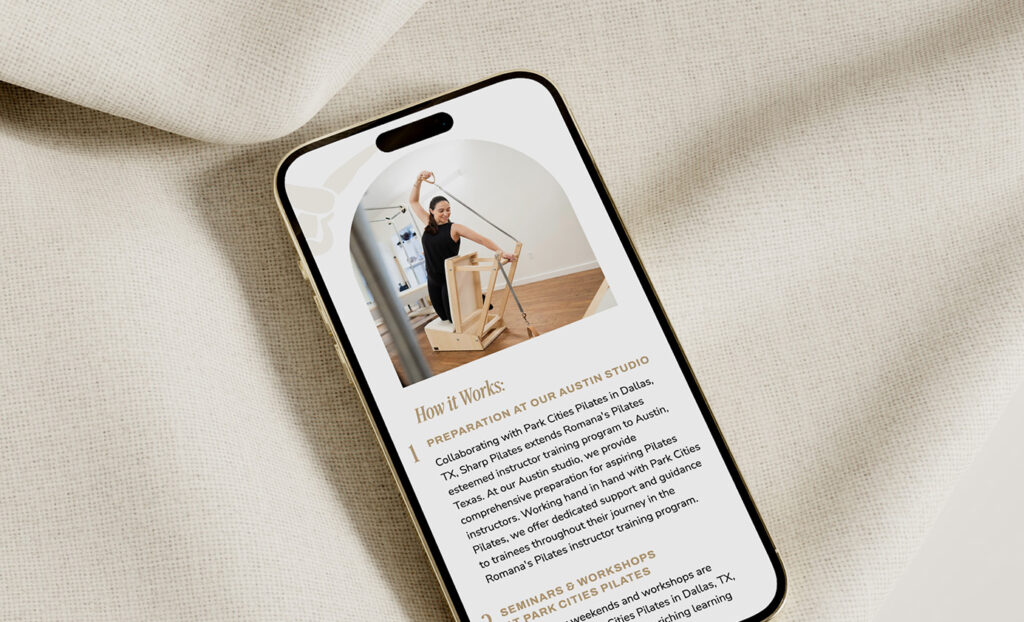
From a design perspective, we aimed to create a refined, welcoming, contemporary feel with minimal layouts, quick-to-read sections, and whimsical illustrations. Curved photos bring in a unique element that feels both structured and organic, reflecting the shapes of a classical Pilates practice.
It’s been so fun to see this brand come to life! If you’re in the Austin area, definitely check out this beautiful studio and their new website at sharppilates.com.
PS. This semi-custom site was created from the Eunoia website template. Customize it to fit your brand by purchasing the Eunoia template in the template shop today.


FILED IN:
Clients, Design, Portfolio
SHARE ON: