The Arrow Methid
February 17, 2022
February 17, 2022
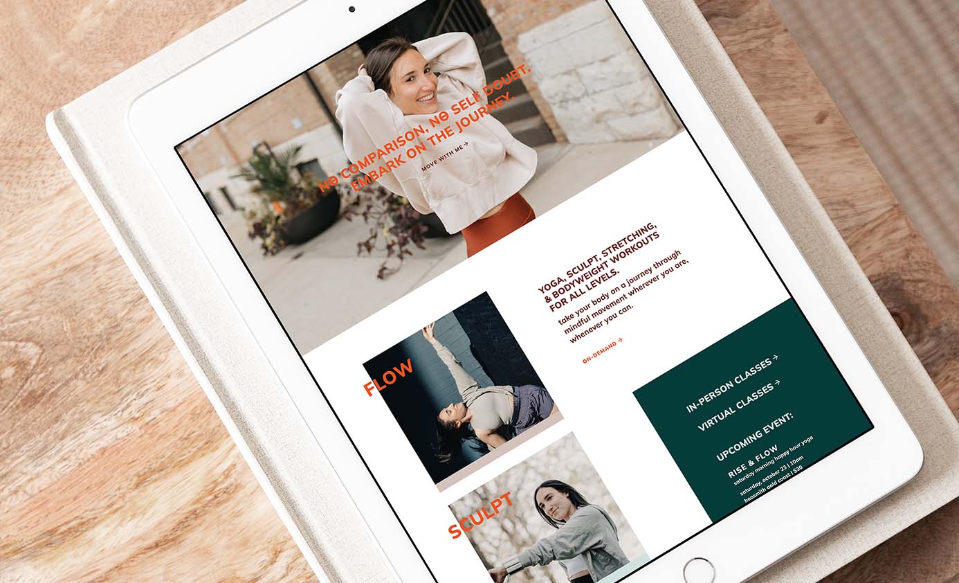
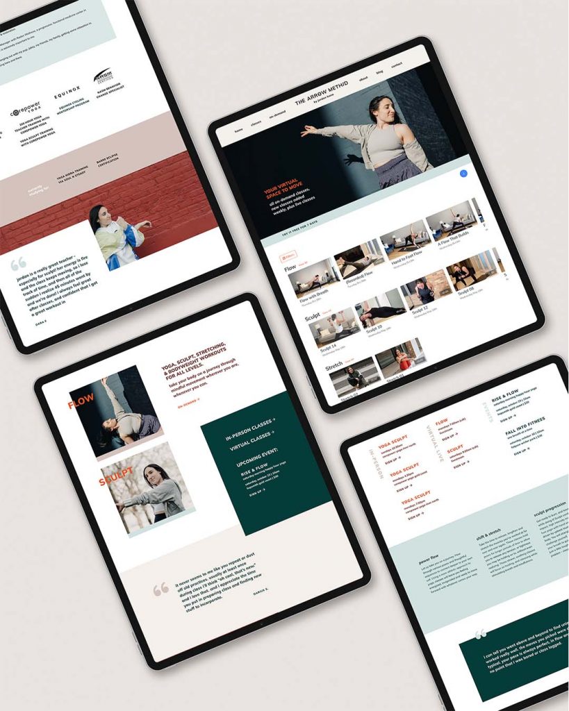
New brand and website launch this week for yoga teacher and trainer, Jordan Hana, founder of The Arrow MethID.
The Arrow MethID offers a variety of joy-filled workouts that take people on a journey to reach their target without comparison or self-doubt. The brand needed to feel invigorating, relatable, and empowering, never exclusive or mundane.
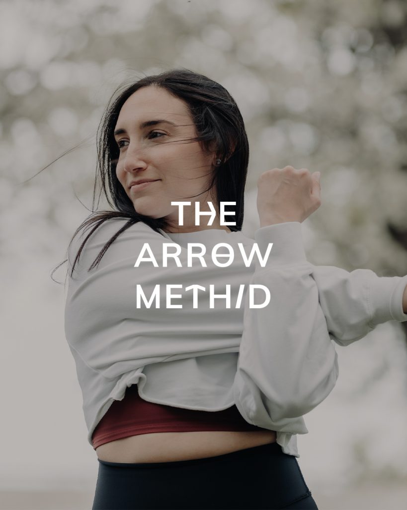
When creating the logos I integrated elements from her previous logo mark and meaningful, personal tattoo into the letterforms to give off a similar energy, but in a cleaner, more modern way. These customizations also add interest to the strong, minimal sans serif.
I angled the “I” of MethID to emphasize the ID (identity) element of the brand. Making this letter unique also makes it clear this spelling is an intentional decision, not a mistake.
Throughout the rest of the brand we used typography that has a clean, strong, approachable feel. By varying casing and weights of the same font family, we created a simplicity that lets her voice and content shine. The color palette feels playful and fun. It mixes a bold, loud red with more cooling blues and neutral tones. This allows for the colors to not feel too in-your-face, while still being energetic and unique.


FILED IN:
Clients, Design
SHARE ON: