Last year I worked with Paige, founder of Undone, to create a semi-custom site using some existing branding she worked on with a friend. So I was thrilled when she came to me this summer, with a business that has grown and evolved, looking for a custom brand identity to match.
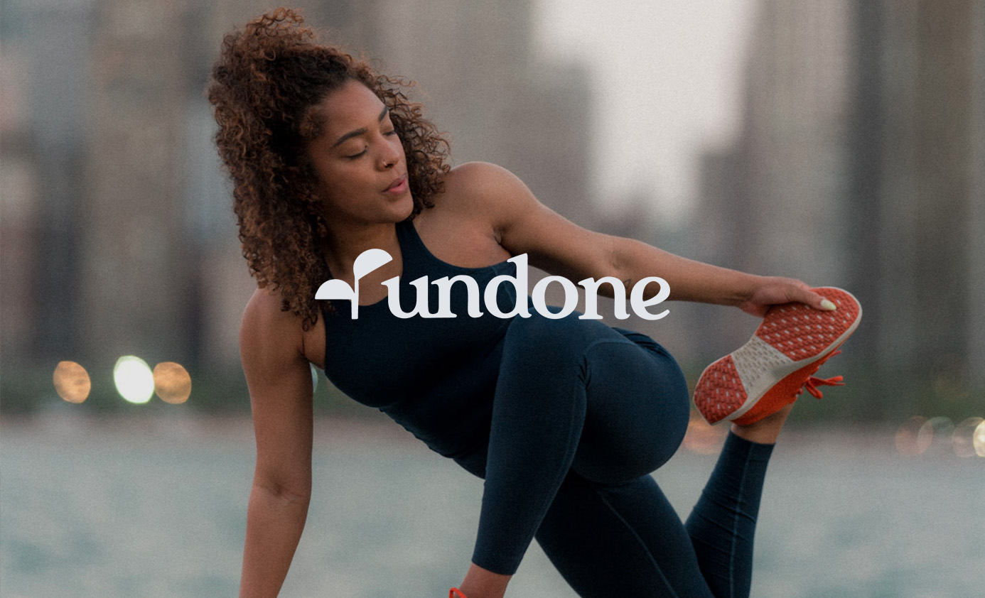
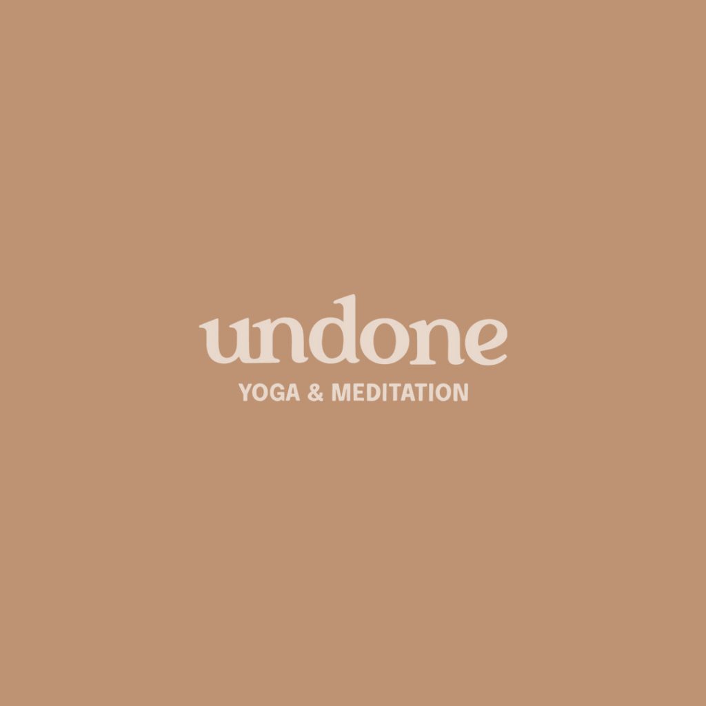
Undone creates elevate pop-up yoga & meditation experiences that help people find a sense of renewal, joy, and inspiration to move beyond their mental or physical wall, even after leaving class or closing their tab.
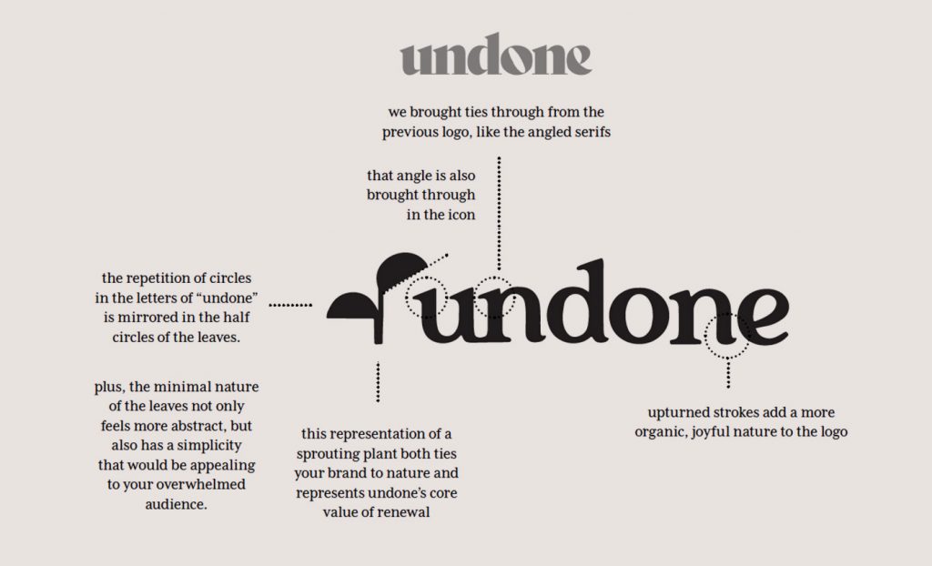
While maintaining the elevated feel of her previous logo, we softened the new wordmark a bit to create more organic connections that feel more welcoming and natural (nature being a large inspiration for her work). Upturned strokes add a joyful element to the letterforms.
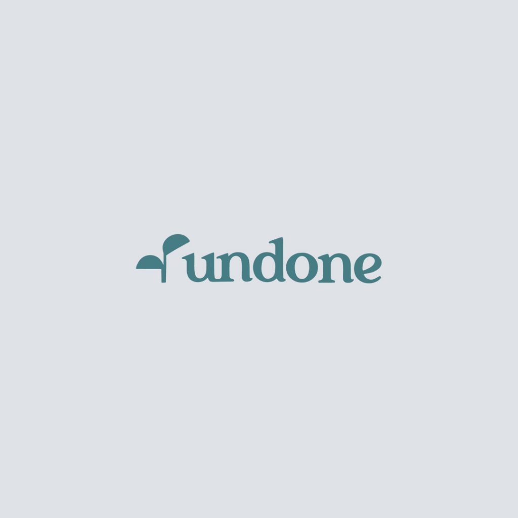
The new brand icon, representing a sprouting plant, both ties her brand to nature and represents Undone’s core value of renewal. The repetition of circles in the letters of “undone” is mirrored in the half circles of the leaves. Plus, the minimal nature of the leaves not only feels more abstract, but also has a simplicity that would be appealing to her overwhelmed, burnt out audience.
The new color palette melds the calming colors of nature and the joyful energy of the city. It conveys a peaceful tone without feeling sleepy, using rich colors that will really create that sense of renewal.
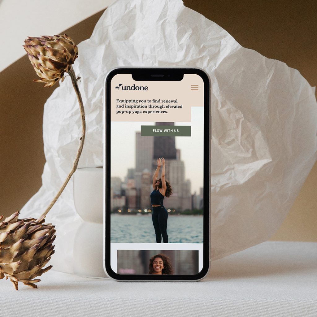
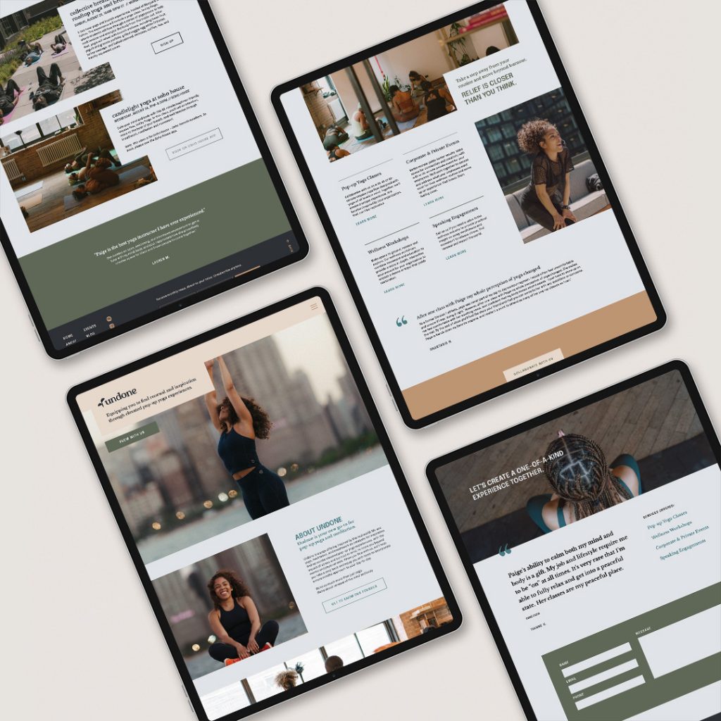
Then, of course we brought all of these brand updates and a few content changes into her website!
I LOVE how this brand turned out and I can’t wait to see Undone continue to thrive and grow!
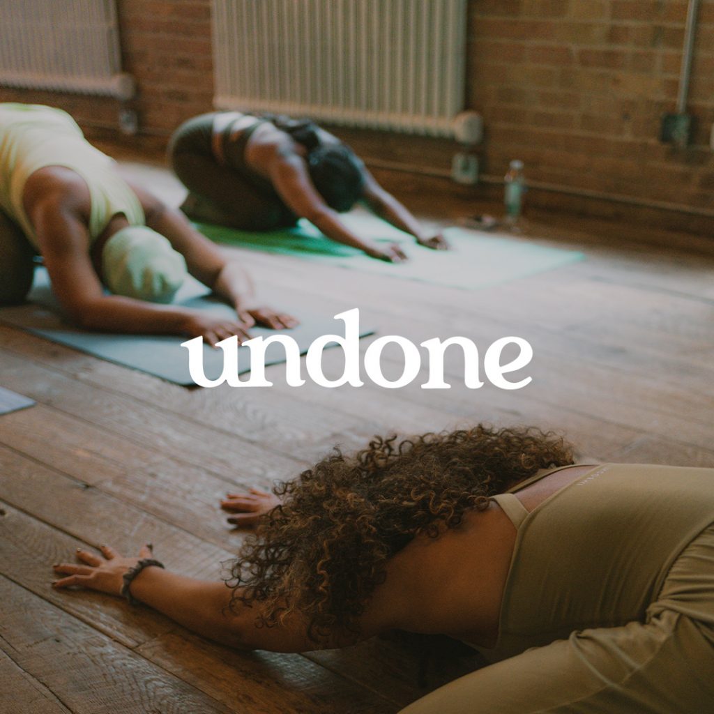
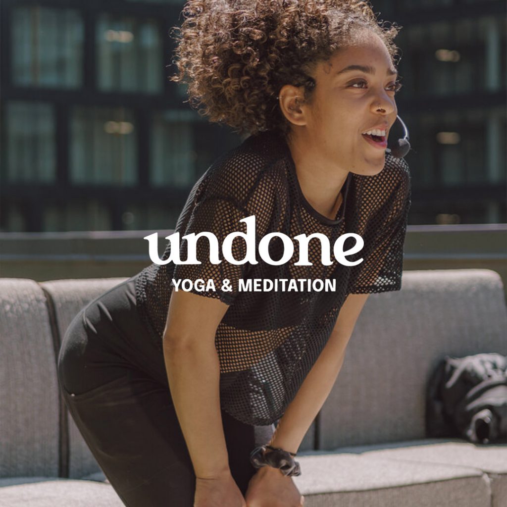

Brand photography by Matt Battiest


FILED IN:
Clients, Design, Portfolio, Portfolio: Airbnb, Portfolio: Alo Moves, Portfolio: Dotdash Meredith, Portfolio: Fabletics, Portfolio: lululemon, Portfolio: New Balance, Portfolio: The North Face, Portfolio: Wilson
SHARE ON: