Athletes Eat
June 9, 2021
Working with Linda was such a cool experience as she is a Sports Registered Dietitian catering exclusively to high performance athletes. Hearing the case studies and everything her clients have accomplished with her highly personalized approach was so fascinating!
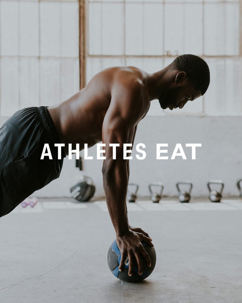
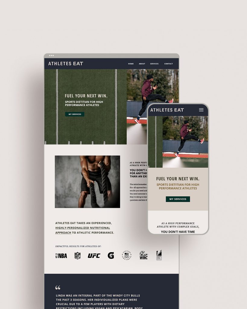
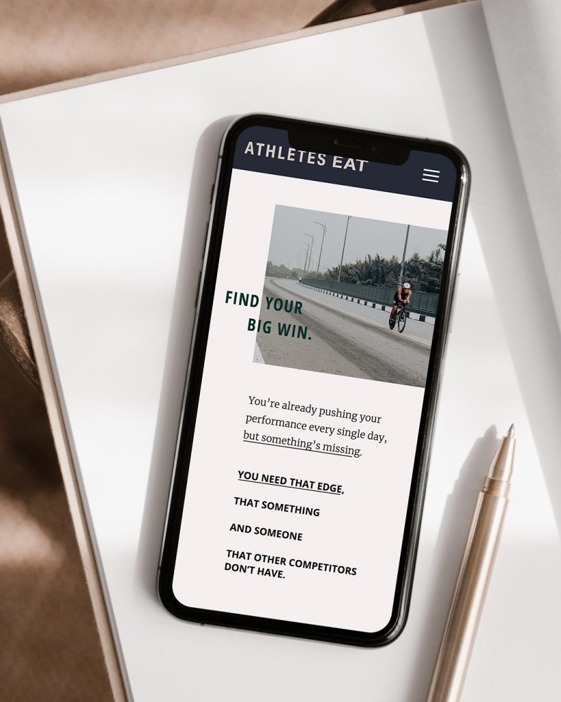
From sweat testing to body composition protocols, Athletes Eat provides the level of detail athletes need to perform at a professional level. So when designing her brand and website we had a very clear audience in mind, customizing the letterforms of her logo to feel sleek and dynamic. Her brand shouldn’t feel like a dietitian or doctor; it should appeal to athletes. That’s what we did.
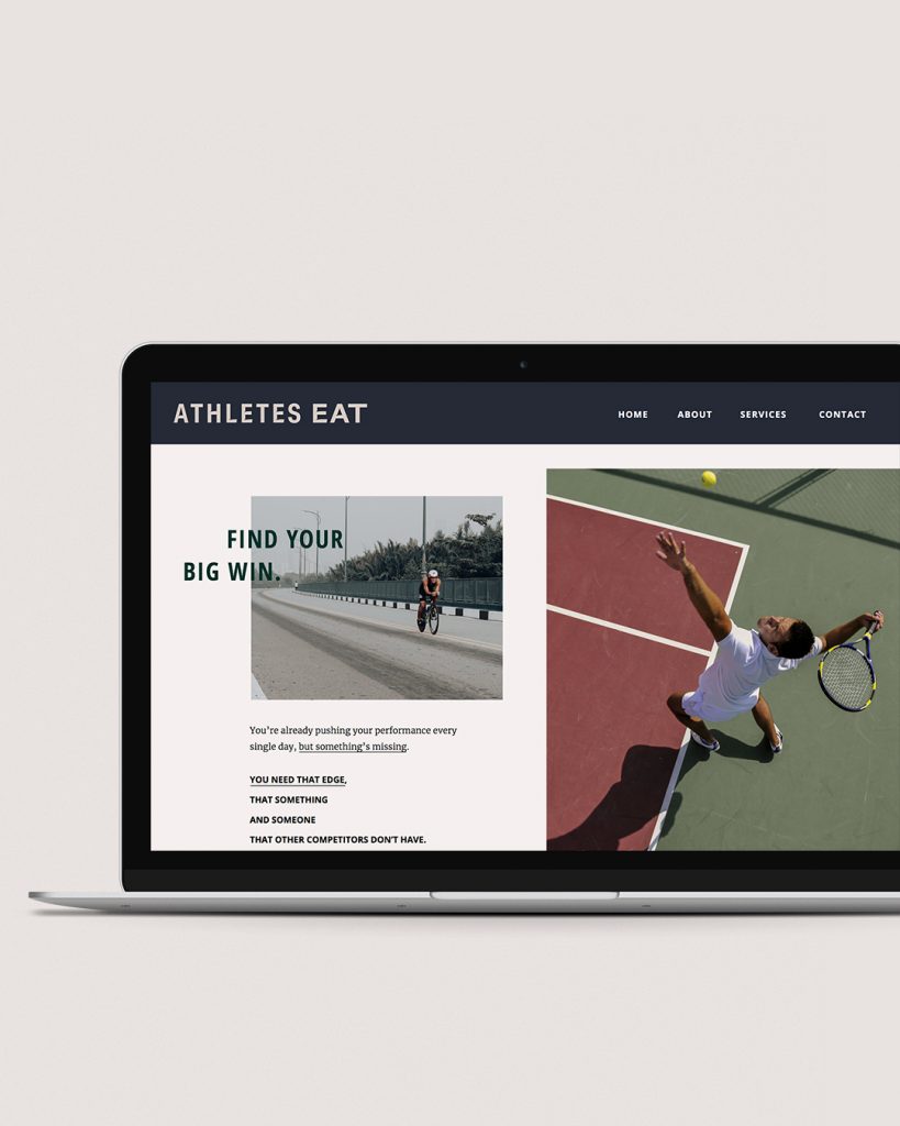
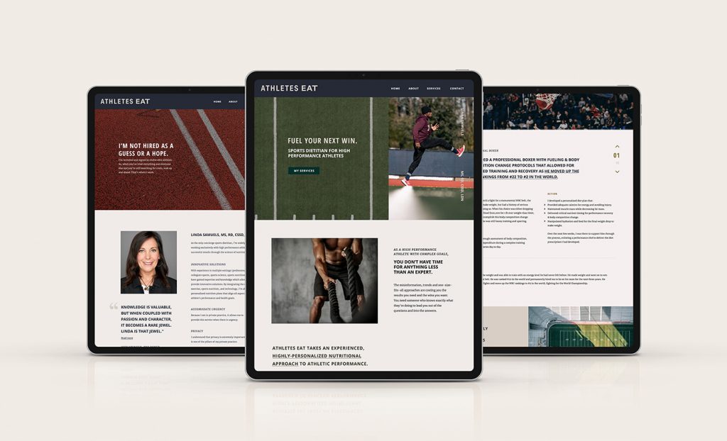
In the Athletes Eat web design, I focused on:
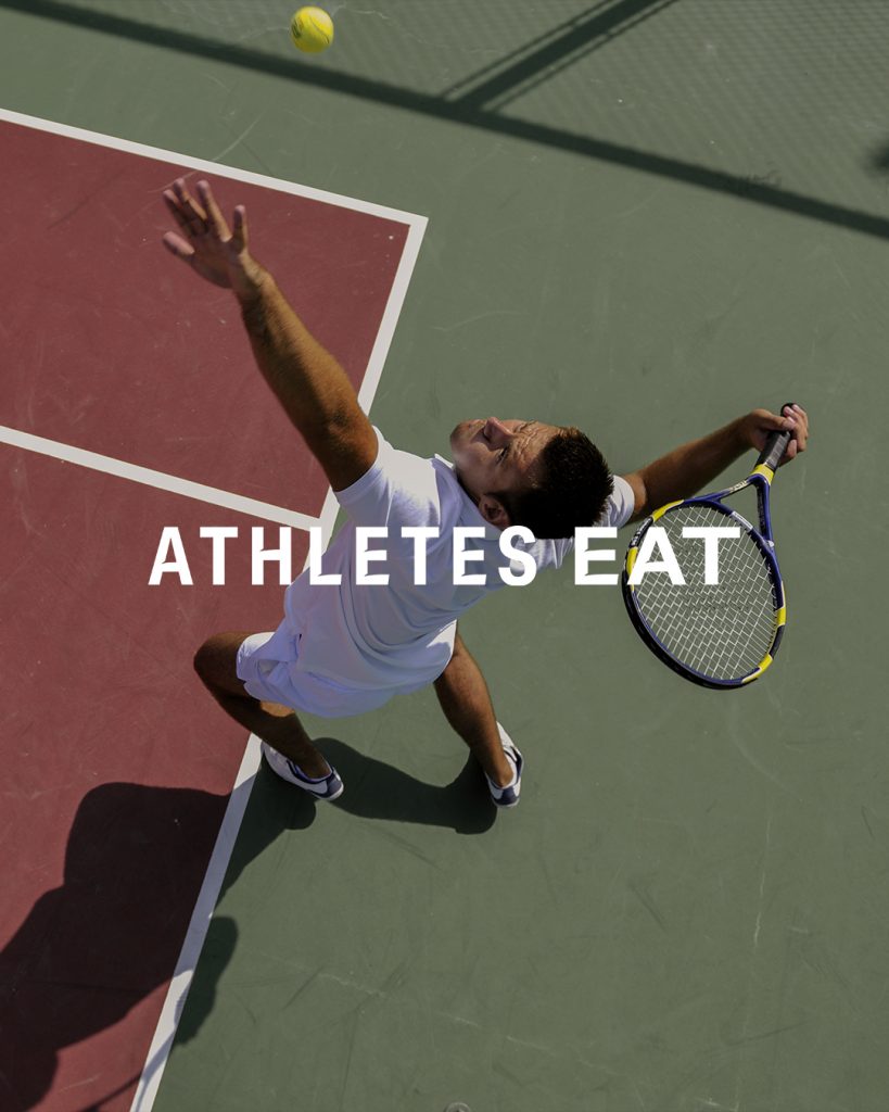
- Sourcing photography that connects with her audience, feels energetic, and captures moments of sport.
- With a lot of potential information to share, but an audience with limited time, typographic hierarchy was key in communicating the most important messages.
- Interactive sections provide the option of reading more without the initial overwhelm of a ton of copy.
Check out athletes-eat.com to view the full new website design!
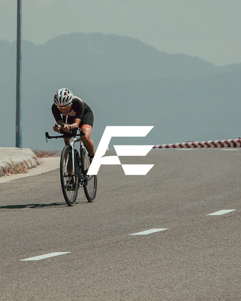
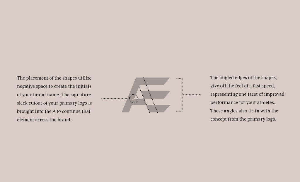
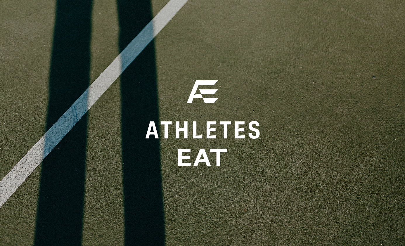
I loved creating the icon for the Athletes Eat brand. Having an icon is so helpful in situations where you need a small mark to represent your business, whether for a website favicon, social media profile, or brand apparel.
For this mark the placement of shapes utilize negative space to create the initials of Athletes Eat. The sleek cutout from the primary logo is mirrored in the A. The angled edges of the E, give off the feel of a fast speed, representing one facet of improved performance for her athletes.
Mockups made from Moyo Studio.
You might also like:


FILED IN:
Clients, Design, Portfolio: New Balance, Portfolio: The North Face
SHARE ON: