Design Like a Pro Tip #5: Consider These Factors That Affect Contrast
August 1, 2023
August 1, 2023
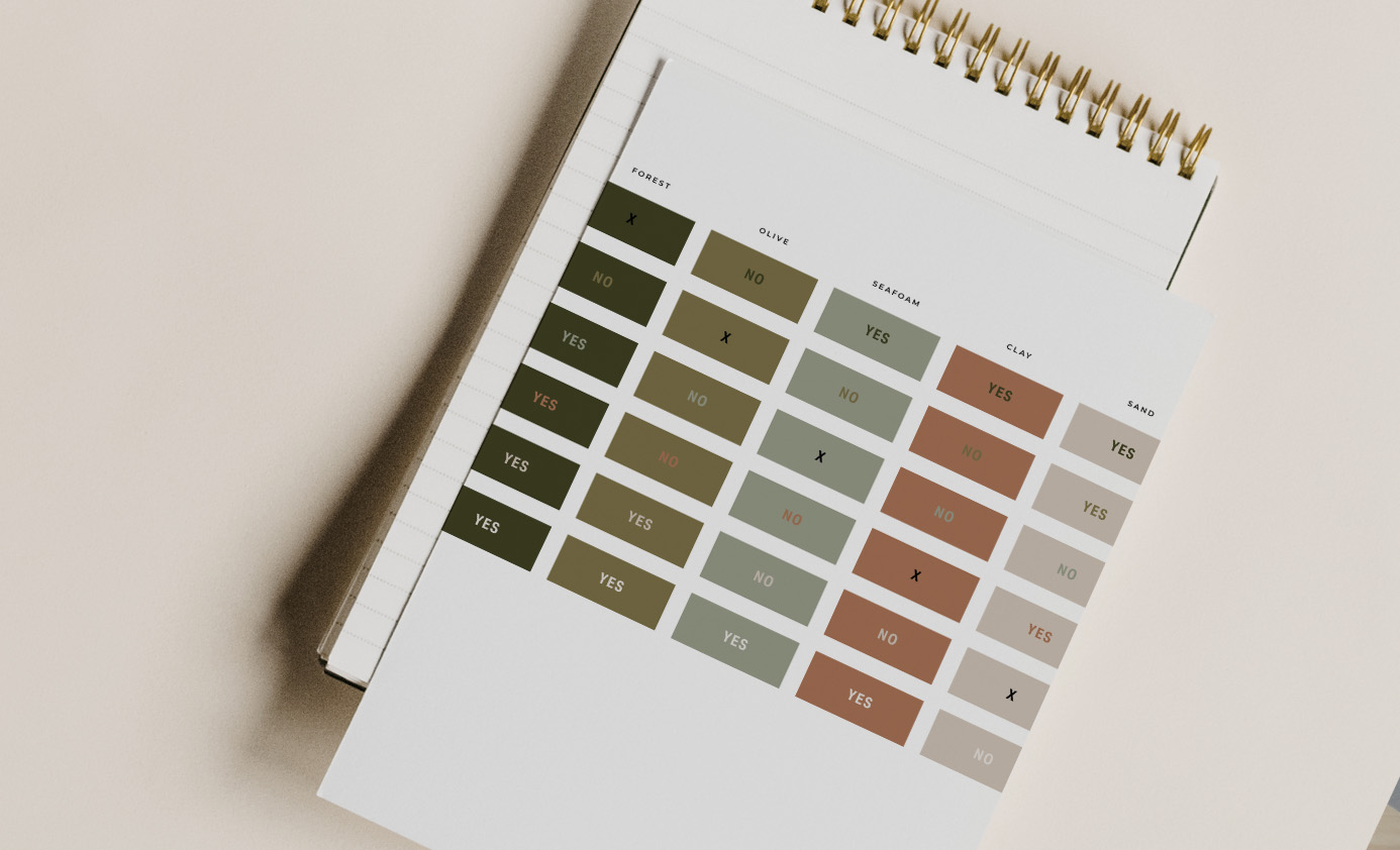
When you’re creating any designs for your brand, whether it’s your website or instagram graphics you want to be conscious of creating enough contrast, especially with type.
Some factors to consider when deciding whether you should layer two colors over one another:
✔️ How small or large is the type? With larger text you can get away with slightly less contrast.
✔️ Similarly, how heavy or light is the type? Heavier weight type can stand out with less contrast than the fine lines of a light typeface.
✔️ Are you applying color to an icon or larger illustration? Just like a heavier typeface, the weight of icon will help it stand out even with a little less contrast.
Overall it’s better to lean towards higher contrast layers of elements to ensure your audience can read your valuable information!
I’d love to see your amazing business create an equally amazing impression on potential clients. So I started this series to help make your website and marketing graphics stand out and look professional. For more design lessons and tips (plus web templates and 1:1 support) join the Fit-Pro Launch Lab
FILED IN:
Design, Design Like a Pro Series, Tips
SHARE ON: