It’s Rachel Pierce
August 24, 2023
August 24, 2023
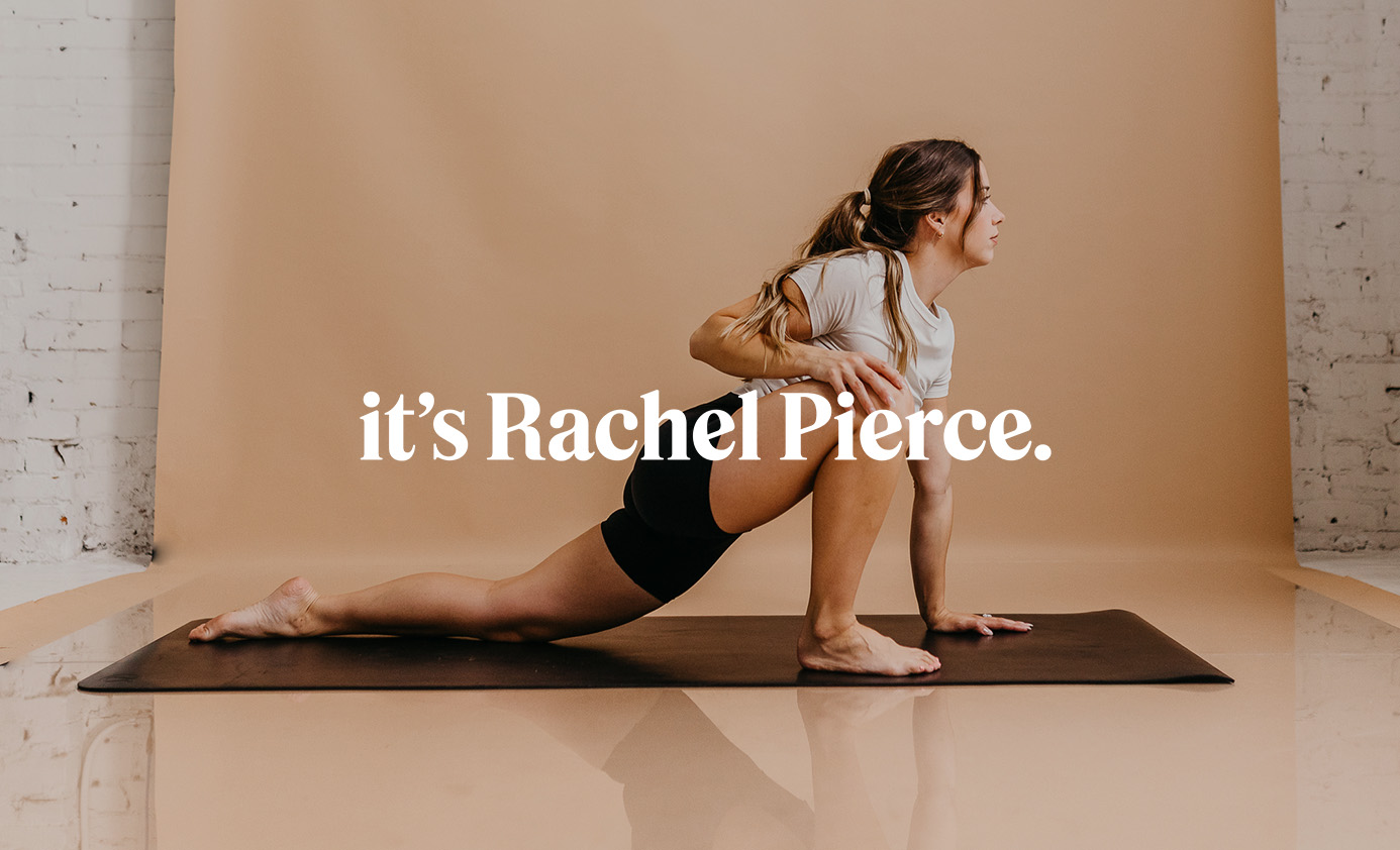
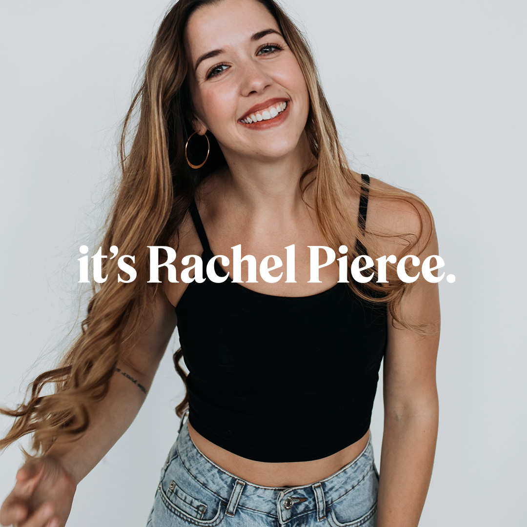
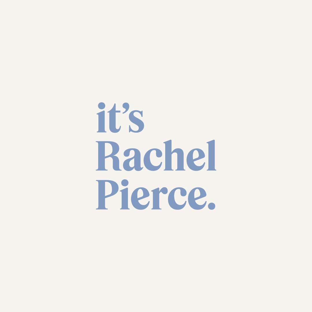
I’m so excited to share this rebrand and website refresh for It’s Rachel Pierce. Rachel and I first worked together a couple years ago on her original brand, Rae Arete, and now with some shifts in her business direction, I’m so grateful to get to work with her again!
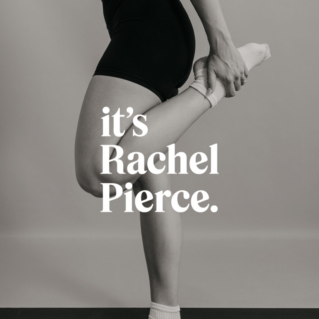
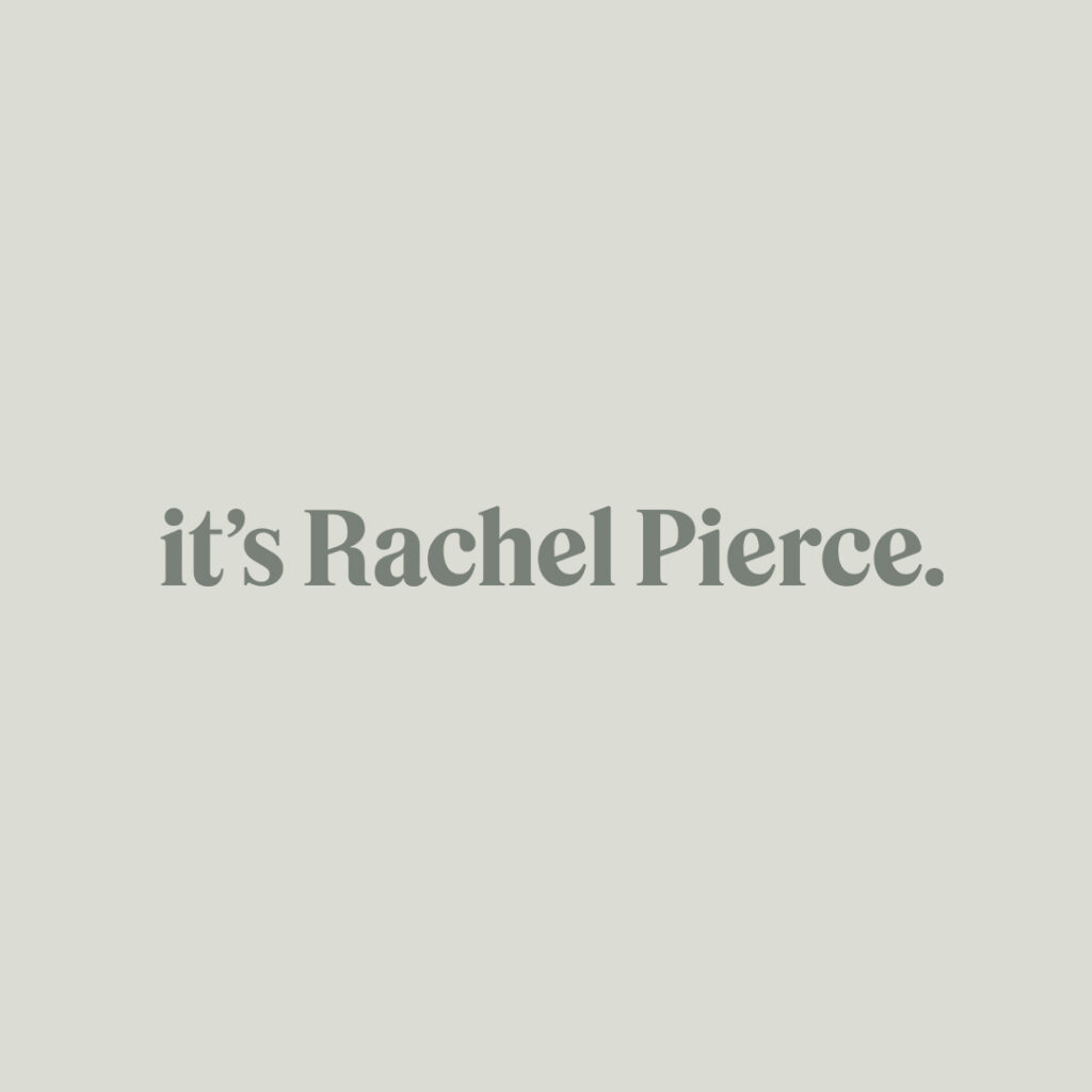
In the brand identity I started with a bold serif font that reflects the strength of women, a core value of the brand. Then, I softened the connection on the serifs and in various places throughout the letterforms to feel more human and convey compassion. I adjusted the style of the leg on the R slightly to call back to the R on her previous logo. Angled cross bars on the R, P, and E’s represent growth and always striving for improvement and excellence (this also ties back to her original brand).
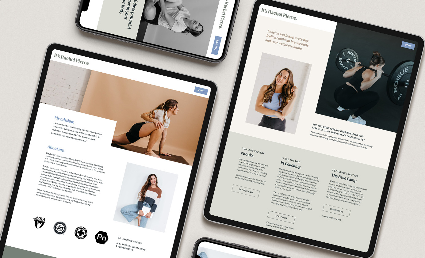
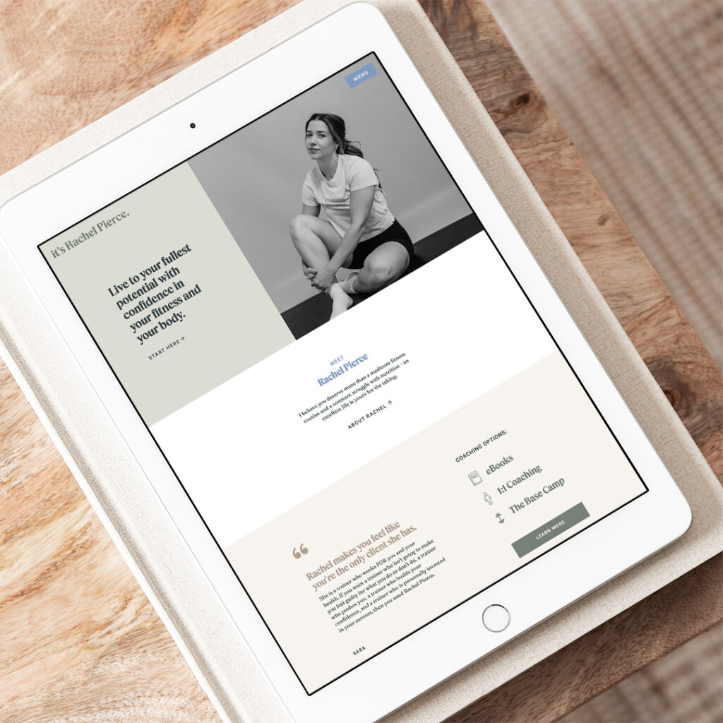
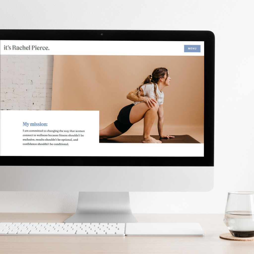
Then we brought all those brand updates into her existing website along with a few minor content changes.
FILED IN:
Clients, Design, Portfolio, Portfolio: Wilson
SHARE ON: